Veda is a powerful and versatile Shopify theme developed by 610 WebLab, designed to help online businesses create stunning and high-performing stores. Whether you run a small boutique or a large-scale enterprise, Veda offers the perfect balance of speed, flexibility, and modern aesthetics to enhance your brand.
With Veda, you can easily showcase a wide range of products, organize complex navigation menus, and deliver a smooth, user-friendly shopping experience. Its advanced customization options allow you to tailor your store to match your unique vision, helping you attract customers and boost sales effortlessly.
Why choose Veda?
Stand Out from the Crowd
Veda comes with three professionally designed styles, giving you the perfect foundation to create a high-converting eCommerce store. These styles are crafted to make your store visually appealing and help you shine in a competitive market.
Designed for a Seamless Shopping Experience
User experience is at the heart of Veda. The theme ensures smooth browsing, easy navigation, and a hassle-free checkout process, helping turn visitors into loyal customers.
Full Customization, No Coding Needed
Veda gives you complete control over your store’s design. Customize colors, fonts, layouts, and more—effortlessly match your brand without writing a single line of code.
Need Help with Veda? We've Got You Covered!
No matter where you are in your eCommerce journey, Veda is designed to support you every step of the way. Whether you're launching your first Shopify store or managing a growing business, 610 WebLab provides expert support and valuable resources to help you succeed.
Expert Assistance: Get guidance from our team to maximize your store’s potential.
Comprehensive Resources: Access tutorials and documentation to make setup and customization effortless.
Quick Resolutions: Facing an issue? Our dedicated support team is ready to assist you with fast and effective solutions.
Transferring Theme Settings & Customizations
Once you upload the new theme, follow these steps to move your settings, custom templates, and modifications seamlessly:
Access Your Current Theme:
Navigate to your theme settings.
Click Actions > Edit Code.
Copy & Transfer Files:
Locate the following files in your old theme.
Copy them and paste them into the corresponding folders in the new theme version.
Support
Veda Theme Support Policy
At Veda Theme, we are committed to delivering exceptional support, ensuring a seamless experience for every user. From store setup and troubleshooting to customization guidance, our expert team is always ready to assist you with quick and effective solutions.
What Our Support Covers
Theme Installation Assistance – Get step-by-step guidance on installing and configuring Veda Theme for your store.
Bug Fixes – Encountering a theme-related issue? We’ll help diagnose and fix any bugs affecting performance.
Customization Guidance – Learn how to use built-in customization options to modify colors, layouts, and other design elements—no coding required.
Theme Updates – Ensure a smooth upgrade process while keeping your settings and customizations intact.
Basic Troubleshooting – Get support for common issues like layout problems, missing elements, or display errors.
Help Center – Explore our detailed documentation and FAQs for step-by-step solutions.
Community Forum – Join discussions with other Veda users, share ideas, and find helpful tips.
We aim to respond to all inquiries within 24-48 hours on business days. Your success is our priority, and we’re here to help you get the most out of Veda Theme!
Getting started
Install Veda Theme
A guide to install Veda theme for your Shopify store
Try Veda from Shopify Theme Store for free
If you want to explore the Veda theme before committing to a purchase, Shopify allows you to try the theme with your store.
Click Try theme to add the trial theme to your online store.
The theme will be applied to your store, but it won’t go live until you publish it.
If you're happy with how the theme looks on your store, you can buy Veda and keep all the customizations that you've made.
Buy Veda from Shopify Theme Store
If you want to explore the Veda theme before committing to a purchase, Shopify allows you to try the theme with your store.
Steps:
Visit the Shopify Theme Store and choose Veda.
Click Try theme to add the trial theme to your online store.
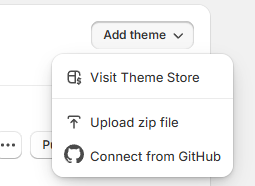
Upload a theme file from your computer
If you have a theme in a ZIP file on your computer, you can upload it to the Themes page in the admin. Before you upload, make sure that your theme files are compressed into a single ZIP file.
Steps:
From your Shopify admin, go to Online Store > Themes.
In the Theme library section, click Add theme > Upload zip file.
In the Upload theme modal, click Add file to select the ZIP file that you want to upload.
Select Upload file. Your chosen theme will be added to the Themes page of your admin.
Update Veda theme
Keeping your Veda theme up-to-date ensures your store benefits from the latest features, bug fixes, and compatibility improvements.
The most up-to-date version of the theme is available on Shopify Theme Store.
⚠ Important Notice
Any code customizations in your current theme are not transferred automatically to a new theme version.You’ll need to manually duplicate and move custom code to the updated theme.
Update the theme automatically ⚙️
Check notifications on Shopify
In your Shopify admin, go to Online Store > Themes. If a new version of Veda is available, you’ll see a notification in your theme library.
Review update details
Click the notification to view more details about the update.
Select View release notes to read what’s new in the release.
Add to Theme library
Click Add to theme library to download and add the updated version of Veda to your Shopify store. The updated version will now appear in your theme library, ready to customize and publish
Troubleshooting: No update notification?
If you don’t see an update notification, it could be due to code customizations conflicting with Shopify’s update system. In this case, you can manually reinstall the theme.
Steps:
From your Shopify admin, go to Online Store > Themes.
In the Theme library section, click Add theme > Upload zip file.
In the Upload theme modal, click Add file to select the ZIP file that you want to upload.
Select Upload file. Your chosen theme will be added to the Themes page of your admin.
Preparing for the update: Create a backup
Before updating your theme, always duplicate your current theme to create a backup. This ensures you can restore your store if something goes wrong.
Steps:
From your Shopify admin, go to Online Store > Themes.
Under the Actions dropdown for your current theme, select Duplicate.
Rename the duplicated file.
Upload the latest theme version
Once you’ve downloaded the updated Veda theme from the Shopify Theme Store, upload it to your Shopify store.
Steps:
From your Shopify admin, go to Online Store > Themes.
In the Theme library, select Add theme > Upload zip file
In the Upload theme modal, click Add file and select the file you want to upload.
Click Upload file.
Move the theme settings and pages
After uploading the new theme, transfer your settings, custom templates, and modifications to the new version.
Steps:
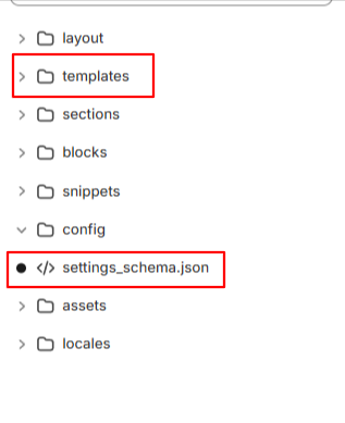
Go to your current theme, click Actions > Edit code.
Copy the following files from the old theme and paste them into the same folders in the new version:
All edited JSON files in the Templates folder.
The settings_data.json file in the Config folder.
Rename the duplicated file.
Re-install apps
Any apps that add code to your theme's files will need to be re-installed. This can be an automatic or manual process depending on the app, so confirm with the app's developer whether removing and adding the app is enough to connect with the new version.
PAGE'S GLOBAL SECTIONS
Global sections are reusable sections that appear across multiple pages in a Shopify theme. These sections provide consistency in design and functionality, ensuring a seamless user experience. They can be customized and configured through the Shopify Theme Editor to match the store's branding and layout requirements.
Announcement bar
A guide to set up a flexible announcement message bar in the Top.
An announcement bar is a brief message display on your site, perfect for capturing customer attention. Use it to highlight important updates, promotions, or countdowns effectively.
How to add an Announcement bar section to your Shopify store
Here’s how you can add an Announcement Bar in the theme editor.
Steps:
Open Theme Editor – In your Shopify admin, go to Online Store > Themes and click Customize on your active theme.
Navigate to the Header Group – In the left sidebar, find the Header section.
Add the Announcement Bar – Click Add section, then select Announcement Bar from the list.
Customize the Content – Modify the text, colors, and settings to fit your store's needs.
Save Changes – Click Save to apply your updates.
This allows you to display important messages, promotions to grab customer attention.
How to edit an Announcement bar section
These settings define the look and functionality of the announcement bar:
Color Scheme – Select a color palette that aligns with your brand identity.
Adjusting Colors
Auto-Rotate Announcements – Enable this option to cycle through multiple messages automatically. Set the interval (e.g., every 5 seconds).
Show hide language selector.
Show country selector
Show social icons
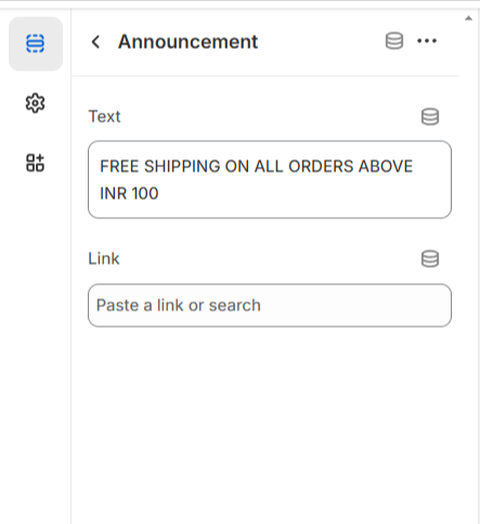
Block Settings
The announcement bar includes two flexible block types: **Announcement** and **Link**. You can add link to the text.
Scrolling bar
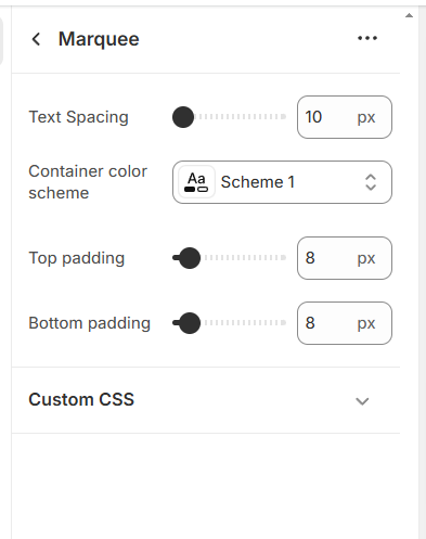
The scrolling bar allows you to display important messages dynamically. You can customize its content, appearance, and spacing using the following options
Scrolling Bar Settings:
Steps:
Text Content : Add and edit the text displayed in the scrolling bar to highlight announcements, promotions, or updates.
Color Scheme: Choose a color scheme that aligns with your brand’s design for better visibility and aesthetics.
Text Spacing: Adjust the spacing between text elements to improve readability and ensure a well-structured appearance.
Section Padding: Modify the padding at the top and bottom of the scrolling bar to control its placement and spacing within the layout.
Text Block:A dedicated text block has been added, allowing for better organization and flexibility in displaying your message.
Adding a Block to the Scrolling Bar Section
To enhance customization, you can add blocks within the scrolling bar section. Follow these steps to add a block:
In the left panel, locate and select the Scrolling Bar section.
Click Add Block within the section.
Choose Text Block to add a new message .
Enter your desired text content.
Adjust the spacing and alignment as needed.
Save Changes.
Header
The header is a vital global section displayed at the top of every page, providing essential navigation and branding elements. It typically includes a logo, navigation menu, search bar, cart icon, and user account access. The header can be customized with different layouts, sticky behavior, and transparency settings.
We have added enhanced navigation options, including a mega menu with images, a dropdown menu, and a menu drawer, allowing for a more interactive and user-friendly experience.
Menus
Our navigation menu is fully customizable, allowing you to choose the layout that best fits your store's style and functionality. You can easily switch between multiple menu types:
Dropdown menu – A classic and clean design that reveals submenus on hover or click.
Mega menu – Perfect for stores with a wide range of categories, this layout displays large, multi-column menus for better organization and visibility.
Drawer menu with Mega menu option – A modern, space-saving design that slides in from the side, with support for submenus and nested navigation.
Drawer - Ideal for mobile-first or minimalist designs, the drawer menu keeps your interface clean while offering easy access to all categories.
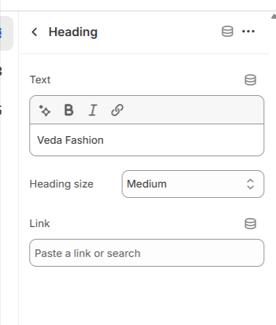
Mega Menu:
Veda theme provides a diverse selection of blocks for the mega menu, enabling you to design a highly functional and visually captivating navigation experience.
Steps:
Open the theme editor (Customize) and navigate to the Header section.
Click Add block and choose the mega menu block.
Make the necessary adjustments. Like add the mega menu handle (e.g 'Shop' ,'Kids' etc)
Enter your desired text content.
Add images for the mega menu , Title , Link etc.
Save Changes.
Select Mega Menu from the select box
For showing the mega menu first you have to select the Mega Menu from the header section customizer.Follow these steps:
Open the theme editor (Customize) and navigate to the Header section.
Click on the header section.
Go to the Desktop menu type
Select Mega Menu
Save Changes.
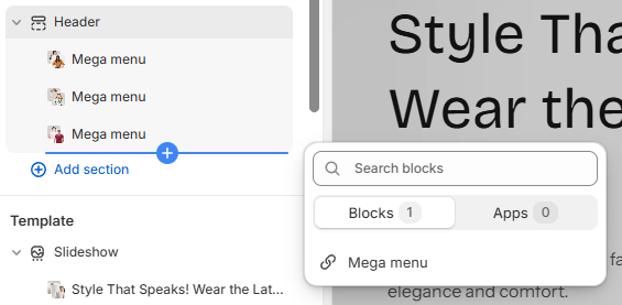
How to Set Up a Mega Menu Block in the Veda Theme
To properly configure a Mega Menu block in the Veda theme, follow these steps:
Open the Theme Editor > Go to your Shopify Admin panel. > Navigate to Online Store > Themes and click Customize on the Veda theme.
Locate the Header Section > In the theme editor, find and select the Header section. > Look for the Mega Menu options within the header settings.
Customize the Mega Menu Block: 1.Select an Image: Choose an image to appear in the mega menu. This can be a category image, a promotional banner, or a featured product image. 2.Add a Title: Enter a relevant title that describes the section (e.g., "New Arrivals," "Best Sellers," or "Seasonal Collection"). 3.Insert a Link: Provide a link where users will be redirected when they click on the image or title. This could be a product page, collection, or external URL.
Save Changes
Mega menu with drawer:
Enhance your desktop navigation experience with our Drawer Menu combined with a Mega Menu—a dynamic, modern layout that slides in from the side while offering a powerful multi-column mega menu inside. This setup gives you the best of both worlds: a sleek drawer interface and rich, organized content display ideal for showcasing categories, collections, or promotions.
With our dynamic settings, you can easily enable or disable the Drawer + Mega Menu option for desktop views—giving you complete control over how your menu behaves across devices, all without touching a line of code.
Customizing the Header in the Veda Theme
In the Veda theme, the Header section offers multiple customization options, allowing you to adjust the logo position, menu type, color schemes, country/region settings, and transparency settings for a more personalized navigation experience. Below is a detailed explanation of each setting:
Logo Positioning
You can set the position of your logo in the header to align with your branding and layout preferences.
Options may include left-aligned, centered, or right-aligned placement.
This ensures that the logo appears exactly where you want it within the header.
Menu Type Selection
The Veda theme allows you to choose from different menu styles:
Dropdown Menu: A simple menu that expands when clicked or hovered over.
Mega Menu: A more advanced menu layout with multiple columns, images, and promotional content.
Drawer Menu A slide-out menu that appears from the side, typically used for mobile-friendly navigation.
Color Scheme & Transparency Options
The color scheme of the header can be customized to match your brand’s theme.
You can enable a transparent header, which allows the background to blend seamlessly with the homepage banner or hero image.
The transparent header logo can also be set separately to ensure visibility when the header is transparent.
Adjusting the color scheme ensures that all menu items and text remain readable against different backgrounds.
Country & Region Selector
You can enable the Country/Region selector, allowing users to choose their preferred location.
This is useful for stores that serve multiple countries and need to display region-specific content, currencies, or pricing.
Header Padding (Top & Bottom)
Adjusting the top and bottom padding of the header helps control its overall height.
This ensures the header appears balanced and does not take up unnecessary space on the page.
Proper padding settings also contribute to a more polished and professional layout.
Finalizing Your Header Customization
After making all necessary adjustments, click Save to apply the changes. Your header will now reflect your preferred layout, colors, transparency settings, and navigation style. This level of customization in the Veda theme ensures that your store's header is not only functional but also visually appealing, enhancing the overall shopping experience for your customers! 🚀
Use the Country/Region Selector
Discover how to enable and configure the Country/Region selector for your store. Leveraging multi-currency support can help boost sales and expand your business into new markets, providing a seamless shopping experience for international customers.
How to add more currencies to your site
You can enable the Country/Region selector, allowing users to choose their preferred location.
This is useful for stores that serve multiple countries and need to display region-specific content, currencies, or pricing.
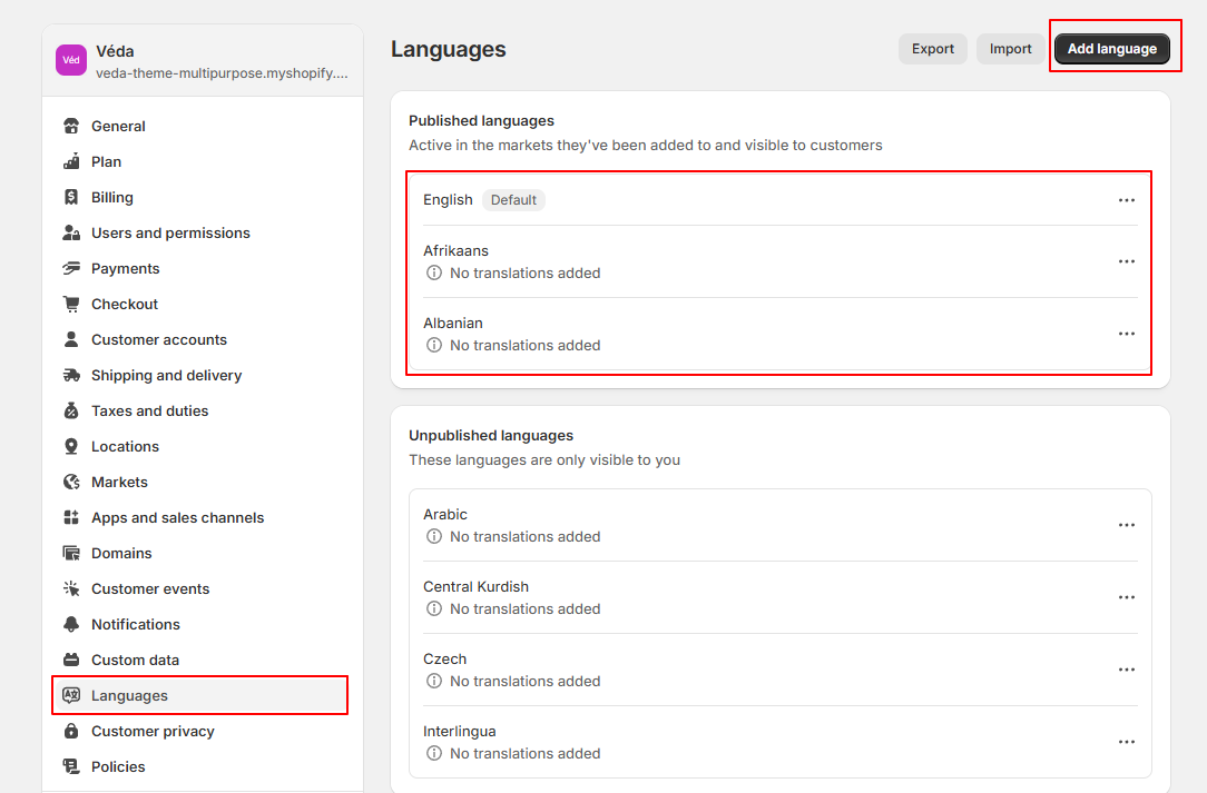
Use Language selector
A multi - language website helps attract international customers and boost sales. To add a language dropdown to your store, follow these steps:
How to Add Multiple Languages
Expanding your Shopify store to support multiple languages enhances user experience, attracts international customers, and increases sales. Follow the steps below to set up and manage multiple languages in your store.
Step 1: Enable Shopify Markets
In Shopify Admin, go to Settings > Languages.
Click Add language.
Select the language you want to add from the dropdown.
Click Add.
It will now enable translations for this language.
While URL slugs can be translated (e.g., /products/en-ca/shoes → /products/es-mx/zapatos), the word "products" itself remains unchanged.
Market-specific URL slugs cannot be customized; translations apply globally to all markets where a language is available.
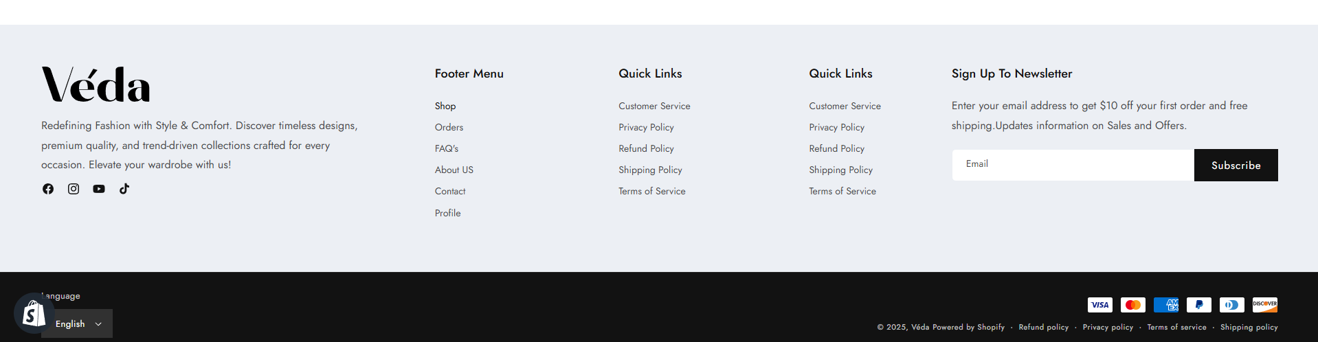
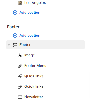
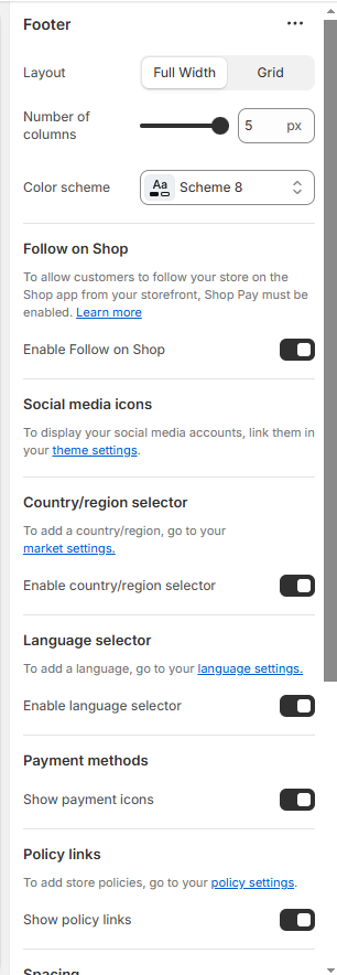
Footer
With the Veda theme, the footer is fully customizable—designed to help you create a strong closing section for your site. Add useful links, newsletter signup, social media icons, contact information, payment icons, and more. You can also adjust the layout (columns, background color, spacing), choose different styles for desktop and mobile, and even include custom content blocks or embedded apps.
What is a Footer?
The footer is the section located at the bottom of a web page. It usually includes a menu with quick links to important pages such as Home, About Us, Blog, Contact, Policies, and more. A well-designed footer enhances navigation, improves user experience, and helps visitors easily find key information on your website.
How to Edit the Footer Section
You can customize the Footer section to match your business needs by adding elements like a footer menu, newsletter signup, store contact details, and other useful blocks. This allows you to create a more user-friendly and informative footer for your website.
Go to your Shopify Admin panel.
Navigate to Online Store > Themes and click Customize on your active theme.
Access the Footer Section:
Add or Modify Blocks:
Footer menu (Quick links to key pages).
Newsletter signup (To collect customer emails)
Store contact details (Address, phone, email)
Social media links
Rearrange or remove any blocks as needed.
Click Save.
A well-structured footer improves navigation, enhances user experience, and provides essential information to visitors.
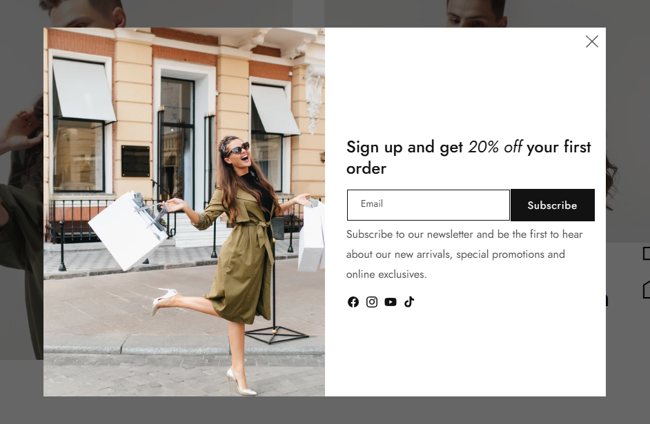
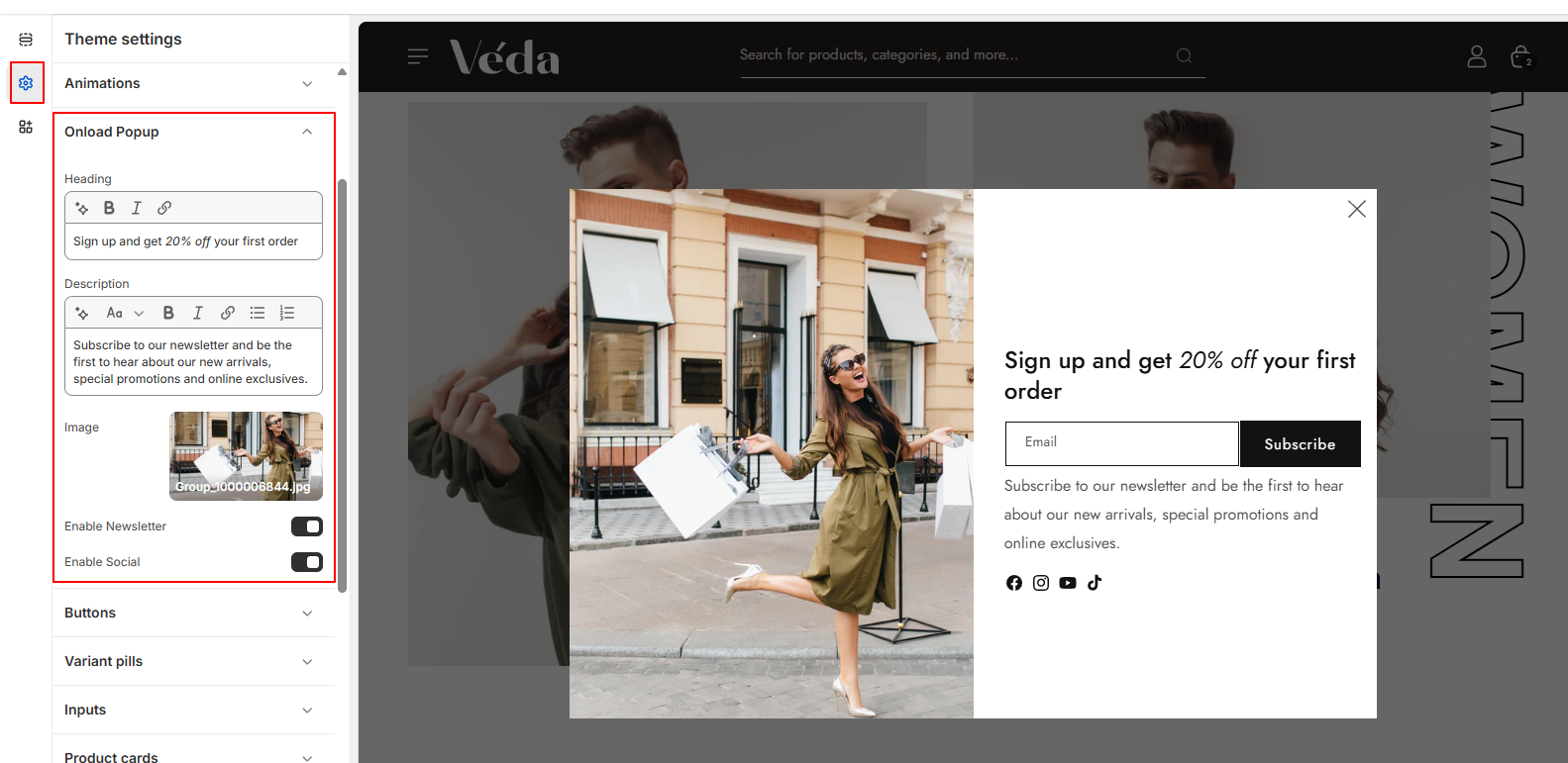
Onload Popup
Create a pop-up for your Shopify store
Popup with One-Time Display Until Closed
This popup functionality ensures that the popup is displayed only once when the page loads and remains visible until the user manually closes it. Once closed, the popup does not reappear unless localStorage is cleared.
Features:
Displays a popup on the first visit.
Hides the popup once the user clicks "Close."
Uses localStorage to remember if the popup was closed.
Provides an option to show/hide newsletter and social media sections.
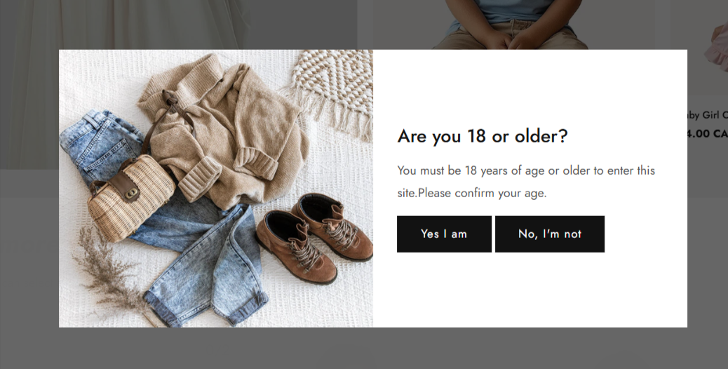
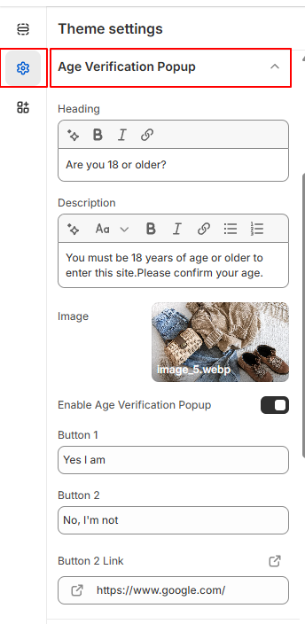
Age Verification Popup
The Age Verification Popup ensures that only users of a specified age can access certain sections of the website. It provides a global setting for enabling or disabling the popup, along with configurable options for button labels and redirection links.
Features:
Global Enable/Disable Setting: Admins can toggle the age verification popup on or off from the theme settings.
Customizable Button Label: Allows modification of the confirmation button text to suit branding needs.
Redirect for Underage Users: If a user does not meet the age requirement, they will be redirected to a specified link (e.g., Google or another safe destination).
Configurable Button Link: Admins can define a custom URL where underage users will be redirected upon clicking the decline button.
How to Use:
Navigate to the Theme Customizer.
Select the Age Verification Popup settings.
Enable/Disable Popup: Toggle the popup on or off.
Confirm Button Label: Set the text for the confirmation button (e.g., "I am 18+" or "Enter Site").
Redirect Link: Define the URL where underage users will be redirected if they do not meet the age requirement.
Save changes and test the popup functionality on the storefront.
Notes
Ensure the redirect link is valid and appropriate for underage users.
Use clear and legally compliant messaging for the age verification.
This feature is useful for websites selling age-restricted products or content.
Cart
Veda Theme: Cart Drawer and Cart Page
In the Veda theme, you can choose how the cart functions on your store by selecting from three options: Cart Drawer, Cart Page, and Cart Notification. These settings can be configured in the Theme Customizer to match your store’s user experience needs.
1. Cart Drawer
The Cart Drawer is a slide-out or pop-up cart that appears when a customer adds an item to their cart. It allows customers to view their cart without leaving the current page.
Benefits:
Provides a seamless shopping experience.
Reduces page reloads and keeps customers engaged.
Ideal for stores that encourage quick checkouts.
How to Enable in Veda Theme:
Open Shopify Admin > Online Store > Themes.
Click Customize on the Veda theme.
Navigate to the Cart Settings.
Select Cart Drawer and save your changes.
Click Save.
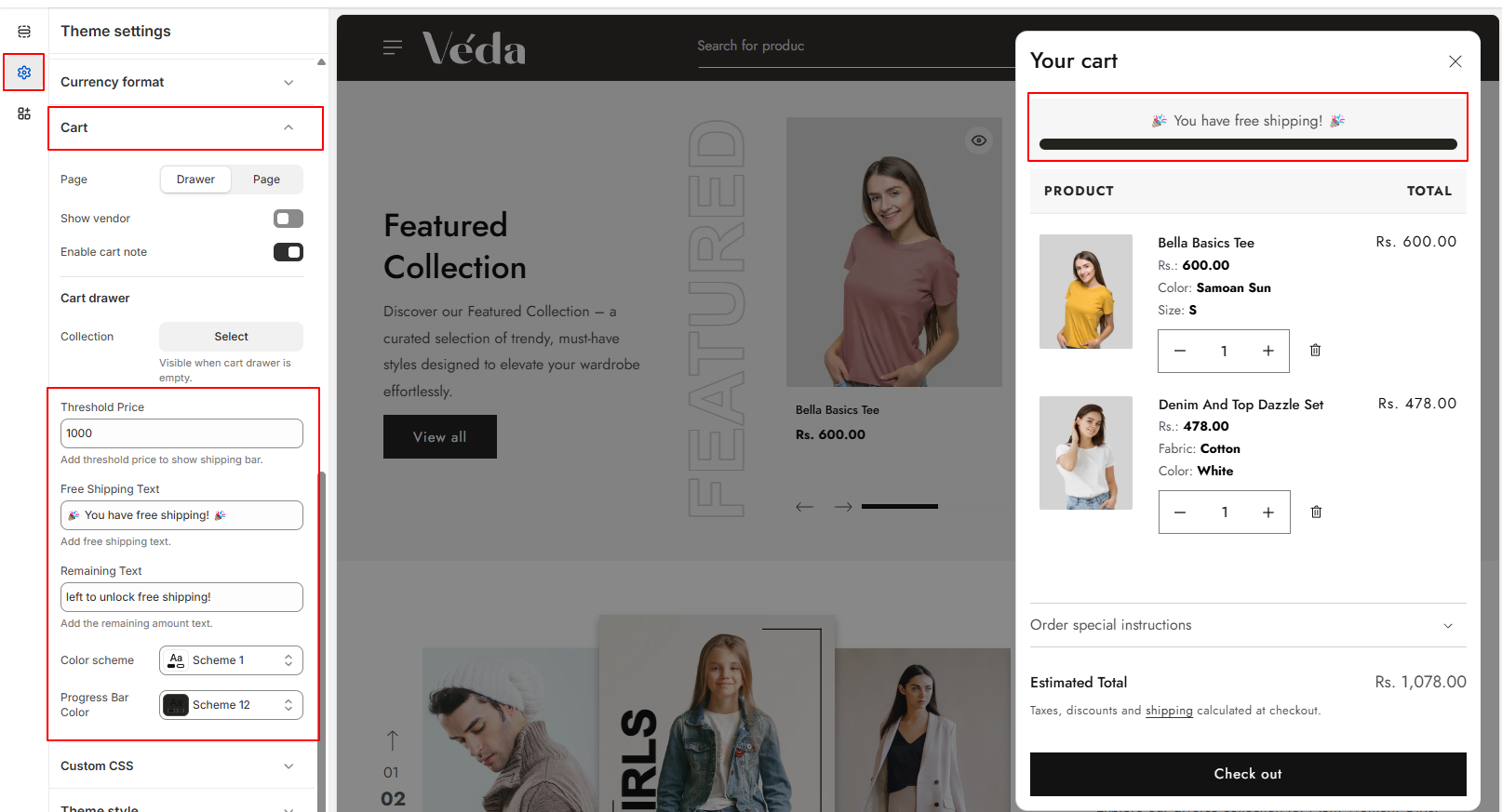
Free Shipping Progress Bar
The Veda theme allows you to display a Free Shipping Progress Bar on both the Cart Drawer and Cart Page. This feature informs customers how much more they need to spend to qualify for free shipping.
How to Configure Free Shipping in Veda Theme:
1. Open Shopify Admin > Online Store > Themes. 2. Click Customize on the Veda theme. 3. Navigate to Cart Settings. 4. Locate the Free Shipping Threshold field and enter the required order amount for free shipping (e.g., $50). 5. Save your changes.
How to Set Up Free Shipping in Shopify Admin:
Go to Shopify Admin
Shipping and Delivery
Under General Shipping Rates, find the shipping zone where you want to offer free shipping.
Click Edit and add a Free Shipping Rate.
Set the condition to match the Threshold Price (e.g., if free shipping is offered on orders over $50, ensure this matches the cart settings).
Save your changes
Managing Free Shipping Text & Remaining Amount Message:
The Veda theme provides options to customize the Free Shipping Text and Remaining Amount Message directly from the theme settings.
This allows you to control how the message is displayed to customers, encouraging them to increase their order value to qualify for free shipping.
You can manage the shipping bar color from the custimzer with dynamic settings. Free shipping bar is working on both cart drawer and cart page.
Cart complementary products
The Complementary Products section enhances the shopping experience by suggesting additional items directly in the cart drawer. This encourages upsells and makes it easy for users to add related products to their cart without navigating away from the current page.
Key Features
Product Slider: A slider displays complementary or recommended products, allowing users to browse and add items quickly.
Add to Cart Functionality: Users can add complementary products to their cart directly from the slider with a single click.
Collection-Based Selection: Choose a specific collection as the source for the complementary products (e.g., Add-ons, Best Sellers, Accessories).
Enable/Disable Toggle: Easily turn the section on or off from the theme settings, giving you full control over when it’s displayed.
How to Manage the Section:
Go to your Theme Editor.
Navigate to the Cart Drawer settings.
Look for the Complementary Products setting.
Select Cart Drawer and save your changes.
Enable or Disable the section
Select the collection of products to display
Save your changes and preview the cart drawer to ensure everything looks correct.
Theme Section :
A well-designed theme section enhances the overall effectiveness of your store by improving navigation, engagement, and visual appeal. The header section plays a crucial role in providing seamless navigation, brand identity, and accessibility. With features like a mega menu with images, a dropdown menu, and a menu drawer, your store can offer an intuitive and user-friendly experience, making it easier for customers to explore products and interact with your brand.
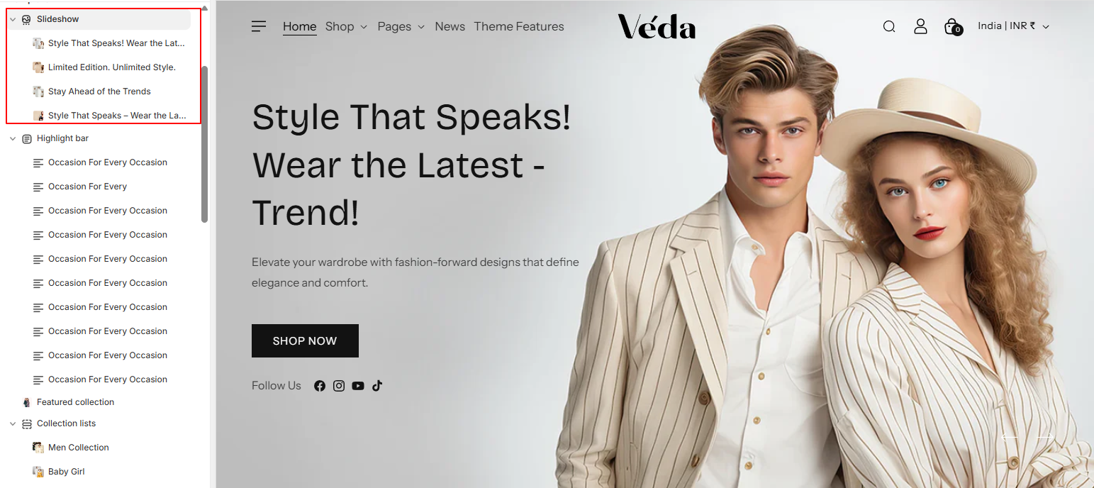
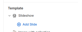
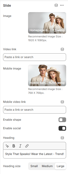
Slideshow Section
This Shopify Slideshow Section is designed to dynamically add a slider if there is more than one slide. It provides various customization options such as:
Automatic Slider Activation – If there is more than one slide, the slider initializes automatically.
Slide Shape Options – Merchants can select different shapes for the slides.
Social Media Icon Colors – Merchants can set custom colors for social media icons.
Button Hover Color – The button text color changes on hover.
Slide Ratio Control – Adjust the aspect ratio of slides.
You can add as many slides as you want in the Theme Editor.
If you add only one slide, it will display as a static image.
If you add more than one slide, the slider will automatically activate.
2. Changing Slide Shape
You can enable the right a left shape which will add some uniqueness to the banner.
3. Auto-Rotate Option
If enabled, the slideshow will automatically change slides every few seconds.
If disabled, users will have to manually navigate the slides.
4. Slide Ratio
You can adjust the width and height ratio of the slides.
This helps make sure the slideshow looks great on different screens.
5. Color Schema
You can adjust the shape color , text color , button color , button background ,button hover color from the color scheme option in block.
5. Adding blocks
For adding the blocks simply click on the customizer > slideshow > add block
Slideshow Blocks Setting :
1. Separate Images for Mobile & Desktop
You can upload one image for desktop and another for mobile.
This ensures that your slideshow looks perfect on all devices.
2. Content Alignment
Left
Right
Center
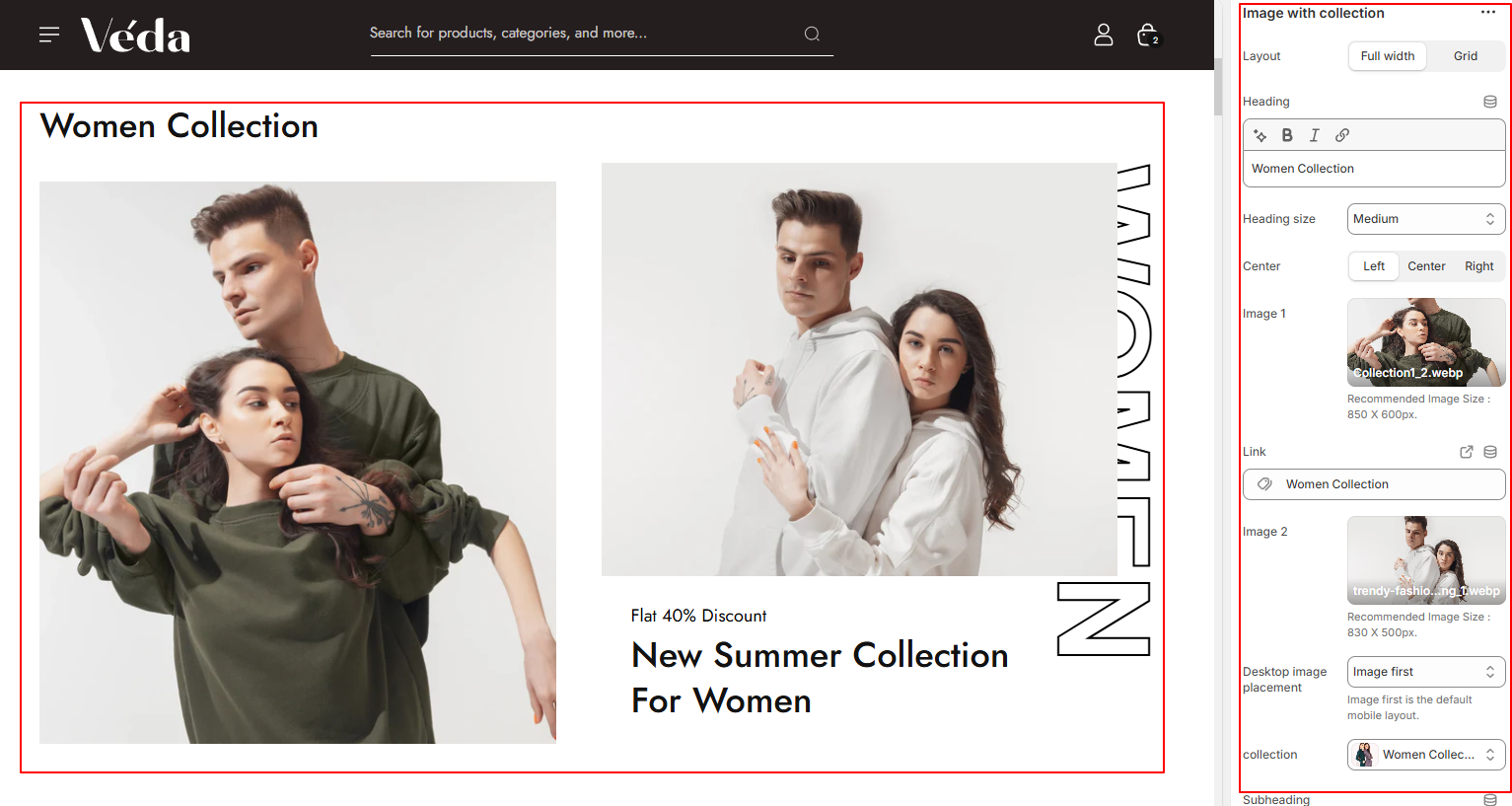
Image with collection
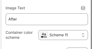
This section allows you to display an image with a collection, along with various customization options to make content management easier. The section includes:
Steps:
Image Upload Option – Add a custom image for the section.
Collection Selection – Choose a Shopify collection to display.
Heading & Description – Add a title and description for better content presentation.
Link Option – Add a button link for redirection.
Vertical Text Option – Display text vertically for a unique layout.
Dynamic Color Options – Customize text, background, and button colors.
Content Alignment – Easily adjust the position of text and images.
Dynamic Heading Size – Change the heading size as needed.
You can upload an image to visually represent the section.
You can select a collection, and it will automatically pull products from that collection.
2. Heading, Description & Link
Add a custom heading and description to describe the collection or featured content.
You can add a link to direct users to a collection or any page.
3. Vertical Text Option
You can enable vertical text to create a unique layout.
This is useful for modern design aesthetics or highlighting key information.
4. Dynamic Color Options
Easily change text color, background color, and button colors from the settings.
This allows you to match the section’s look with your store’s theme.
5. Content Alignment
You can position text and images left, center, or right using simple alignment settings.
6. Dynamic Heading Size and Dynamic Padding Options
You can increase or decrease the heading size dynamically for better readability and design control.
Top & Bottom Padding – Increase or decrease space above/below the section.
Left & Right Padding – Adjust spacing on the sides for better layout control.
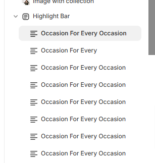
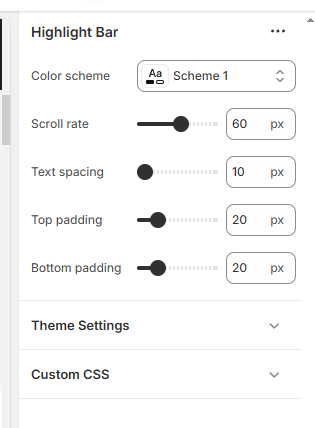
Highlight Bar Section
The Highlight Bar Section is a customizable section designed for displaying important text, announcements, or promotions in a scrolling format. This section includes:
Heading & Heading Size – Add a heading and adjust its size dynamically.
Text Content – Add custom text to display in the bar.
Spacing Between Text – Adjust the space between text items for better readability.
Scroll Rate – Control the speed of the scrolling text.
Padding Options – Adjust the space around the text for a well-balanced layout.
Color Scheme– Customize text and background colors for better visibility.
Block-Based Customization – Each block allows you to set a heading and its size separately.
How It Works :
1. Adding Headings & Text
You can add multiple headings within blocks.
Each block can have a different heading size, allowing for a more dynamic design.
You can also add custom text content to display in the scrolling bar.
2. Adjusting Spacing Between Text
You can increase or decrease the space between text elements to ensure better readability.
3. Controlling the Scroll Rate
Adjust the scroll speed of the text to make it move faster or slower.
A slower scroll works well for important announcements, while a faster scroll can grab attention quickly.
4. Padding Options
You can add padding (extra space) around the text to adjust its position within the section.
Padding can be applied to the top, bottom, left, and right sides separately.
5. Color Scheme Customization
You can adjust the text color , button color , button background ,button hover color from the color scheme option in block.
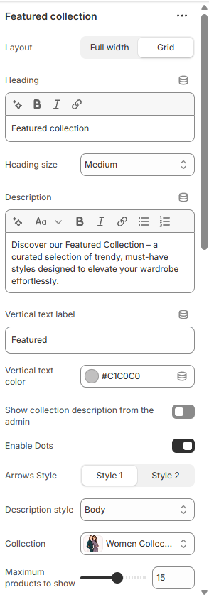
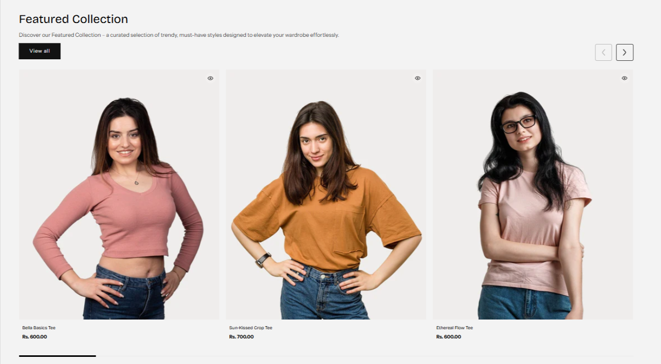
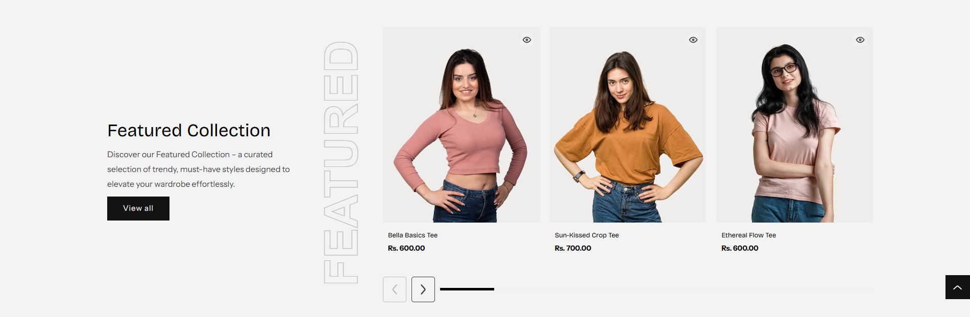
Featured Collection
The Featured Collection section allows you to showcase selected products in a visually appealing way. This section is highly customizable to fit different store layouts and design preferences.
Customization Options:
Full Width or Grid Layout:
Merchants can choose between displaying the collection in a full-width layout, which spans the entire width of the page, or a structured grid format for a more organized look.
The full-width layout is ideal for a bold, immersive design, while the grid layout offers a neat and structured view, making it easier for customers to browse products.
Heading & Description:
A customizable heading and description option is available, allowing merchants to provide context about the featured collection.
This helps in creating engaging product showcases that align with marketing campaigns, seasonal collections, or special promotions.
Heading Size Selection:
Merchants can adjust the heading size directly from the theme customizer to match their store's branding and typography preferences.
This ensures that headings stand out appropriately without overpowering the design.
Vertical Text Option:
This feature allows merchants to display text vertically for a unique and stylish appearance.
It is particularly useful for modern and minimalist themes where text orientation can enhance the visual appeal.
Text Color Option:
Customizable text color settings allow merchants to match the section’s typography with their overall store theme.
This ensures brand consistency and improves readability based on the background and overall design.
Two Display Styles Available:
Merchants can choose between two different styles for the section.
If Style 2 is selected and the Grid Layout is enabled, an alternative view will be displayed, offering a different aesthetic and arrangement of products.
This adds variety and flexibility in showcasing collections based on store design preferences.
Full width and style 2 view :
Grid width and style 1 view :
Product Display Settings:
The section provides control over the number of products displayed.
Merchants can select how many products appear within the section, ensuring it fits within their page layout without overwhelming customers.
Quick View Integration:
The Quick View feature enhances user experience by allowing customers to preview product details without leaving the collection page.
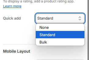
If the Standard Option is selected under Quick Add settings, Quick View will be enabled, making it easier for customers to explore products quickly and efficiently.
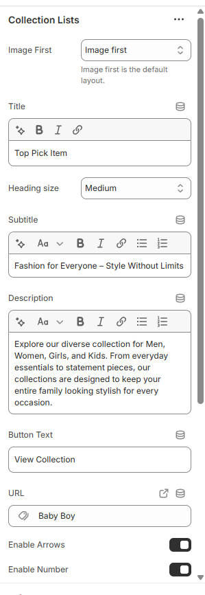
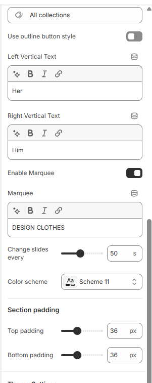
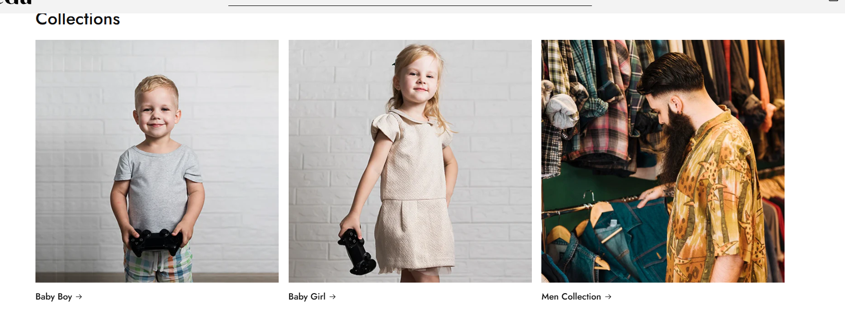
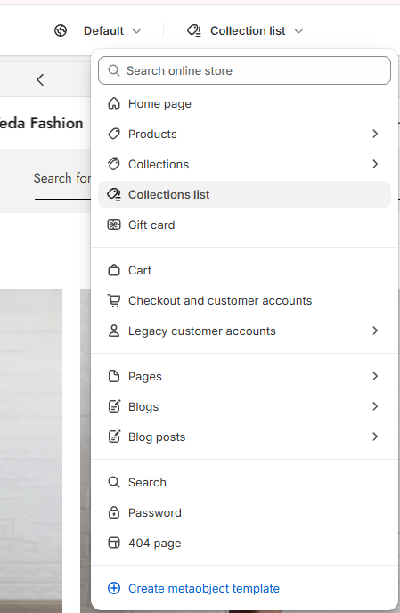
Collection List
The Collection List section allows merchants to showcase multiple collections in a visually appealing slider format. This section is designed for flexibility, enabling store owners to highlight featured collections with custom display settings.
Customization Options:
Collection Image, Title & Link:
Users can select the image, title, and link for each collection.
This helps in creating an engaging storefront where customers can quickly navigate to specific collections.
Slider Controls:
Merchants have the option to show or hide the number of slides displayed.
There is also an option to enable or disable navigation arrows for better control over the slider’s appearance and functionality.
Unique Collection Slider:
A specially designed unique slider is implemented, ensuring a smooth and distinct looping effect for collections.
This enhances the browsing experience, allowing customers to scroll seamlessly through different collections.
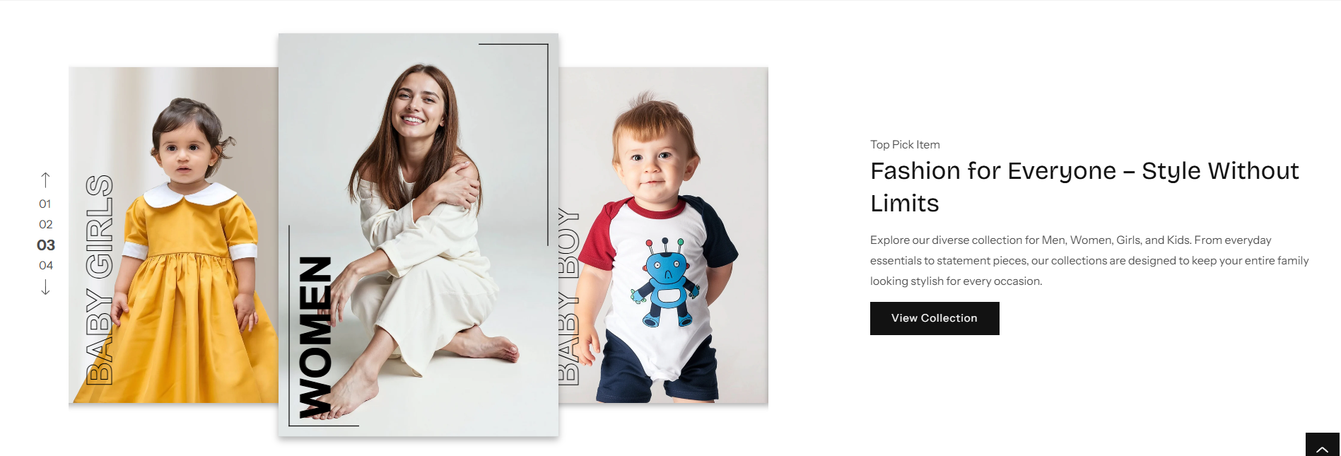
Fashion Split Section:
The Fashion Split Section is a visually engaging layout designed to enhance the presentation of fashion-related content. This section allows merchants to showcase images with dynamic text effects, creating an eye-catching and modern look.
Customization Options:
Image Selection:
Users can upload and display a featured image to complement the fashion content.
The split layout enhances focus by balancing visuals with text elements.
Moving Text in Background:
A dynamic moving text option is included to create an attractive and interactive effect.
This feature adds motion to the background, making the section more visually engaging.
Background & Text Color Options:
Merchants can customize the background color and text color to align with their store’s branding.
Ensures a cohesive and aesthetically pleasing design.
Speed Control for Moving Text:
Allows users to adjust the speed of the moving text to create a desired visual impact.
Provides flexibility in animation control, ensuring it matches the store’s overall theme.
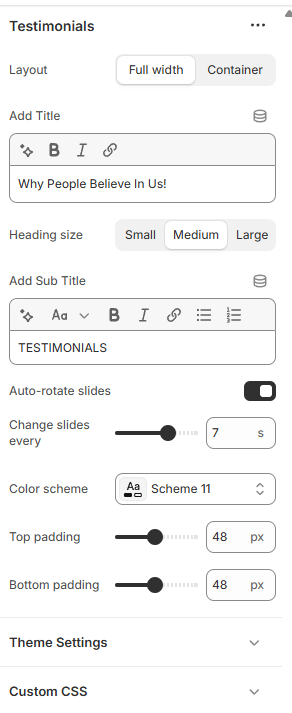
Testimonial Section
The Testimonial Section is designed to showcase customer reviews in an engaging and visually appealing format. This section helps build trust and credibility by displaying authentic feedback from customers.
Customization Options:
Heading & Description:
Merchants can add a custom heading and description to introduce the testimonials section.
This allows for better context and alignment with branding.
Slide Change Ratio:
Users can control how quickly slides transition, ensuring an optimal reading experience.
Provides flexibility in adjusting the speed to match the overall design flow.
Auto-Rotate Option:
Option to enable or disable auto-rotation of testimonials.
If enabled, reviews will cycle through automatically, enhancing user engagement.
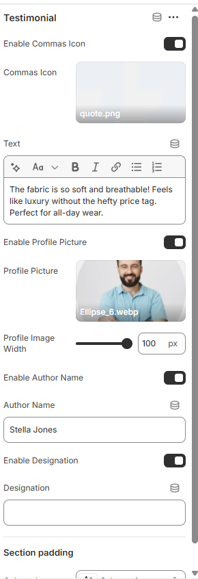
Testimonial Blocks:
Merchants can add multiple testimonial blocks, each containing:
Review Text: Displays customer feedback.
User Image: Upload an image of the reviewer to personalize testimonials.
Reviewer’s Name: Showcases the customer’s name for authenticity.
Designation: Displays the role or position of the reviewer, adding credibility.
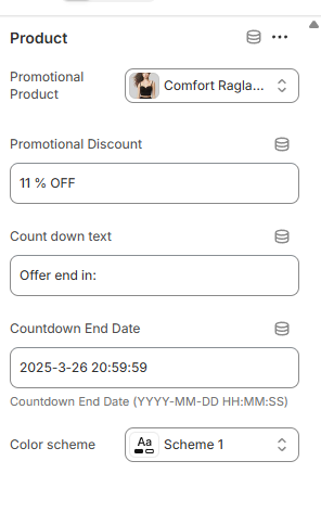
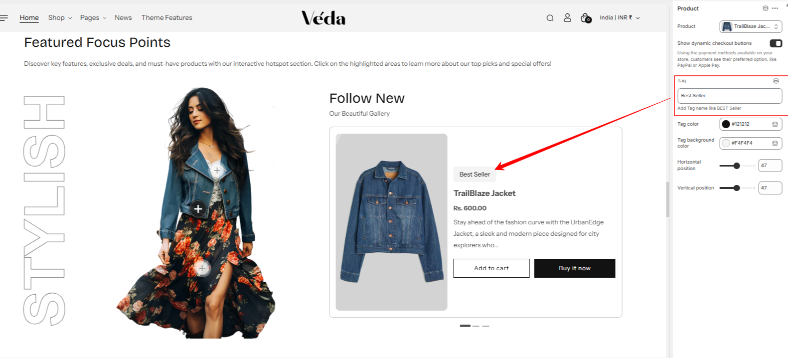
Promotional Banner Section
The Promotional Banner Section is designed to highlight special deals, discounts, or featured products in an eye-catching format. This section allows merchants to create engaging promotional content with customizable settings
Customization Options:
Heading & Text Customization:
Merchants can add a custom heading and description to make the banner more informative.
Includes text alignment settings to position content as needed.
Color scheme settings allow full control over text and background colors.
Blocks:
Users can add multiple blocks within the banner and assign products to each block.
This helps in featuring selected products as part of the promotion.
Discount Display:
If a discount is manually added, it will be displayed on the banner.
If no discount is set but the product has a compared price, the system will automatically calculate and display the discount.
Countdown Timer:
Merchants can set a countdown for promotions, creating urgency and encouraging quick purchases.
The format for the countdown is: Countdown End Date (YYYY-MM-DD HH:MM:SS).
Block Color Scheme:
Added settings for block-specific color schemes.
Allows easy management of individual block styling, making content customization more efficient.
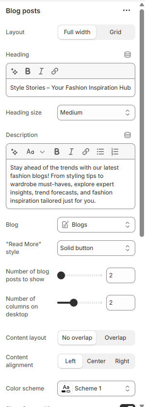
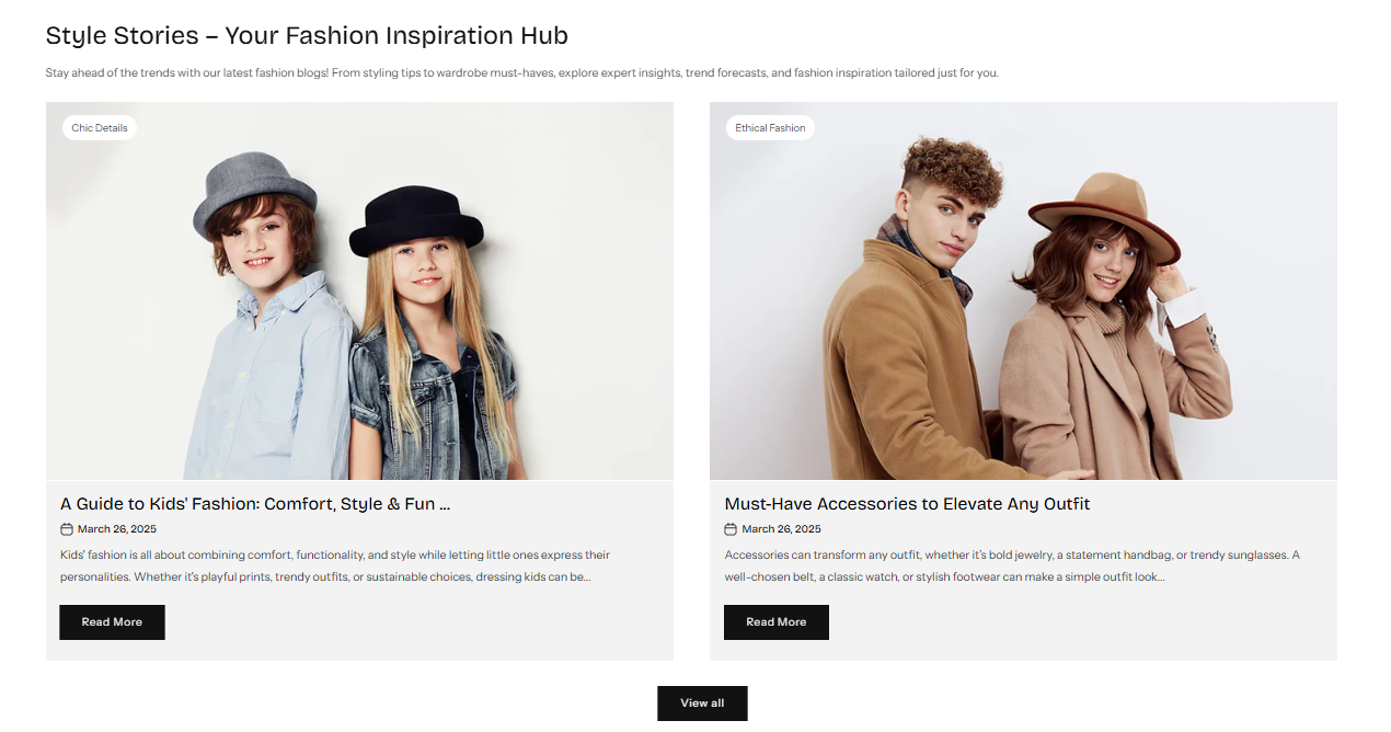
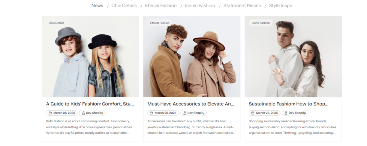
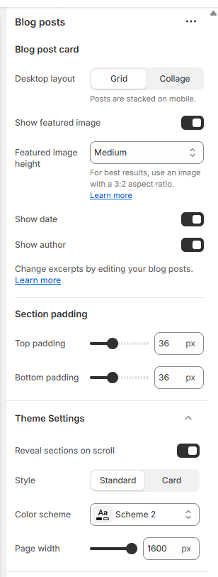
Blog Section
The Blog Section is designed to showcase blog posts in an engaging and customizable format. This section allows merchants to highlight their latest content while providing flexible display options.
Customization Options:
Layout Options:
Choose between Full-Width or Grid Layout to control how blog posts are displayed.
The Full-Width option provides a clean, expansive layout, while the Grid Layout organizes posts in a structured manner.
Full Width View.
Grid View.
Number of Blogs to Display:
Merchants can select how many blog posts they want to showcase in the section.
This ensures a tailored content display based on store design and focus.
Content Overlap Option:
An option to enable or disable content overlapping, allowing for creative text placement over images.
Enhances visual appeal and provides a modern design approach.
Show/Hide Blog Metadata:
Option to display or hide the publication date of the blog post.
Option to show or hide the author’s name, adding credibility and personalization to the content.
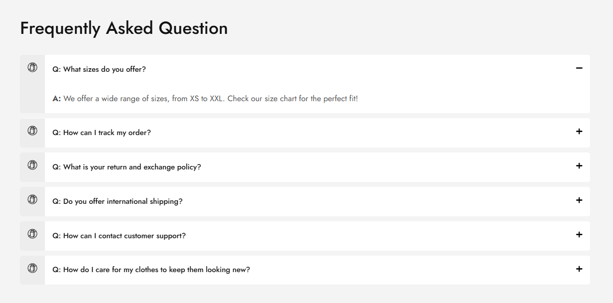
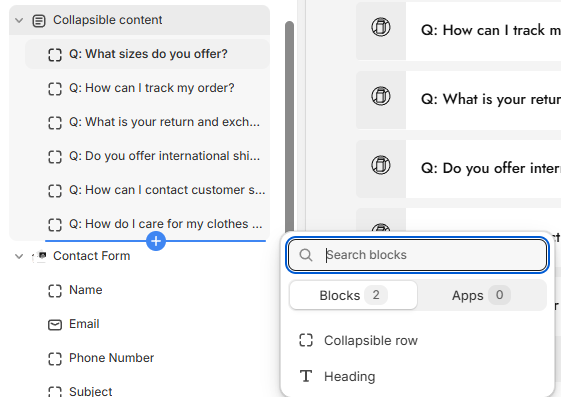
FAQ Section (Collapsible Content)
The Collapsible Content section is designed to present FAQs or important information in an organized and interactive manner. This section helps improve user experience by keeping content structured and easily accessible.
Customization Options:
Heading Block:
Users can add a heading for the FAQ section to provide context.
Helps in categorizing the content for better readability.
Collapsible Rows:
Each collapsible row consists of a question and answer format.
This allows for a clean and space-saving design, making it easier for customers to find relevant information.
Icon Selection:
Users can choose a custom icon for each collapsible row, enhancing the visual appeal and clarity of sections.
Smooth Transition Effect:
The section features a smooth open and close transition, ensuring a seamless user experience.
Enhances the readability and accessibility of the content without disrupting the page layout.
Multimedia Collage Section
The Multimedia Collage Section is a dynamic and visually appealing layout designed to showcase a combination of products, collections, and images in an engaging format. This section enhances storytelling by allowing merchants to mix and match content for a unique display.
Customization Options:
Select Product or Collection Block:
Users can choose to display either a product or a collection image within the collage.
This flexibility allows for a diverse and aesthetically pleasing arrangement of store content.
Product Swatch on Hover:
If a product is selected, the collage will display product swatches on hover.
This feature allows customers to preview different product variations directly from the collage layout, improving interactivity and engagement.
Quick Add-to-Cart Functionality:
When a product is included, a cart icon appears, enabling customers to add the item to their cart with a single click.
Enhances the shopping experience by making purchases more seamless and efficient.
Video Section
The Video Section is designed to enhance storytelling and engagement by allowing merchants to showcase videos seamlessly within their store layout. This section supports both YouTube videos and MP4 uploads, giving users flexibility in content presentation.
Video Source Options:
Select Product or Collection Block:
Users can choose to display either a product or a collection image within the collage.
This flexibility allows for a diverse and aesthetically pleasing arrangement of store content.
Cover Image with Play Icon:
Users can add a cover image to display before the video plays.
Enhances the aesthetic appeal by maintaining a clean layout until the video is interacted with.
Autoplay on Click:
When the play icon is clicked, the video will autoplay for a seamless viewing experience.
Reduces distractions and ensures a smooth transition into video content.
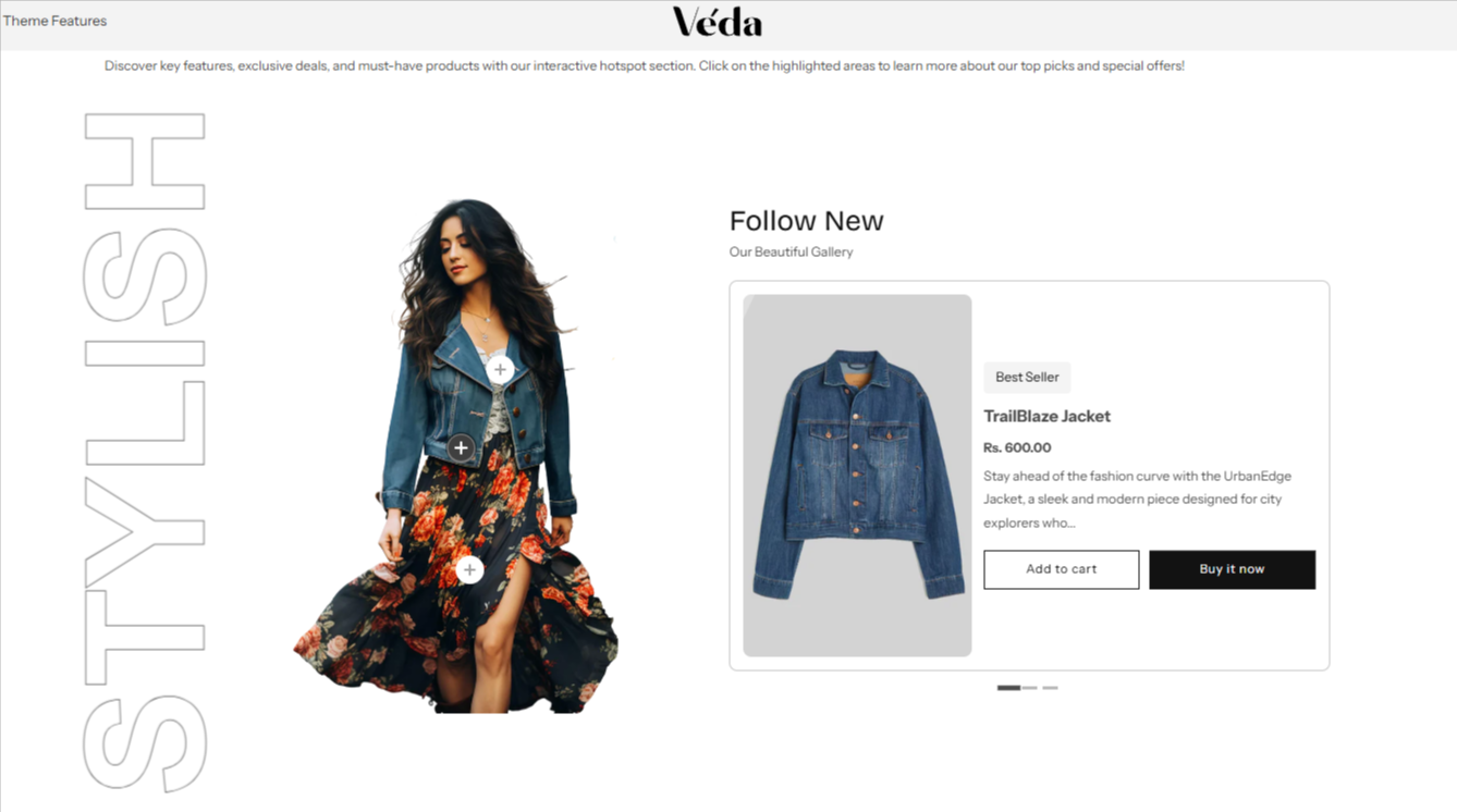
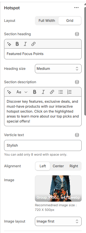
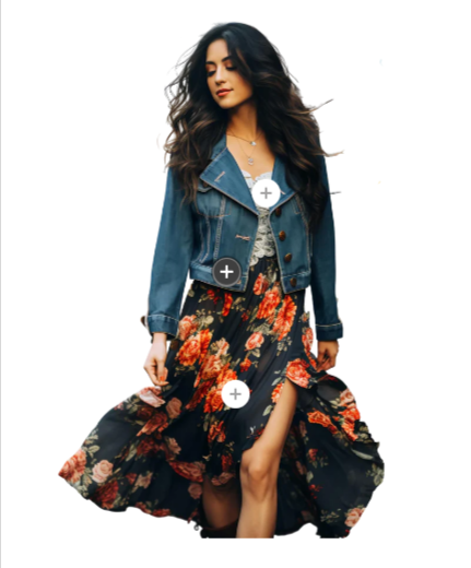
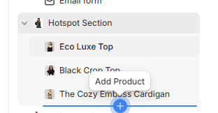
Hot Spot Section
The Hot Spot Section is an advanced interactive feature designed to showcase multiple products within a single image. It allows users to explore products by clicking on strategically placed icons, making it an engaging and visually appealing shopping experience.
Customization Options:
Image & Product Pairing:
One side of the section features a high-quality image with verticle text, which serves as the base for the product hotspots.
The other side displays detailed product information.
This setup allows merchants to create an immersive product showcase by visually linking items to relevant areas in the image.
Interactive Hotspot Icons:
Merchants can place clickable hotspot icons anywhere on the image, linking them to specific products.
When a user clicks on an icon, the corresponding product details will appear.
These icons help create an intuitive and engaging way to highlight product features or variations.
Slider Functionality:
Clicking on a hotspot icon moves a slider that displays the corresponding product.
This transition effect ensures a smooth and seamless navigation experience.
Users can browse through multiple products without leaving the page.
Able to add tag/label to products
Block Settings & Customization:
Merchants can add multiple blocks to customize the section further.
Product Selection: Choose a product to link to the hotspot.
Hotspot Icon Positioning: Adjust the placement of the icon on the image for accurate representation.
Product Information Display: Showcase product name, price, and quick add-to-cart functionality.
Custom Styling Options: Control the appearance of icons and text for seamless integration into the store’s theme.
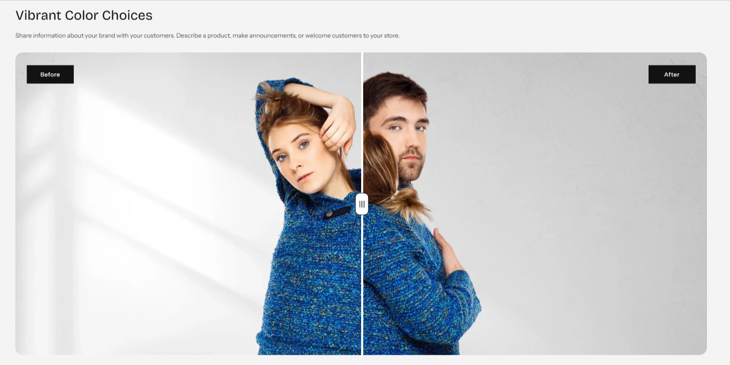
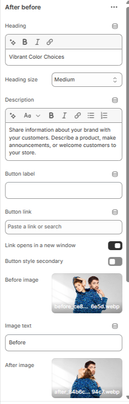
Before & After Section
The Before & After Section is an interactive feature designed to visually compare two images by using a draggable slider. This section is perfect for showcasing product transformations, design improvements, or any type of visual comparison in an engaging way.
Customization Options:
Dual Image Upload:
Merchants can upload two images – one representing the before state and the other showing the after state.
This feature is ideal for presenting product effectiveness, redesigns, or editing effects.
Draggable Comparison Bar:
Users can interactively drag a sliding bar across the images to reveal the before-and-after transformation.
This smooth transition enhances user engagement and provides a clear visual representation of changes.
Heading & Description Options:
Add a custom heading to describe the transformation being displayed.
Provide a detailed description to offer context and explanation about the comparison.
Section Color Schema:
Customizable background colors and text colors allow seamless integration with the store’s theme.
Ensures branding consistency and enhances overall aesthetics.
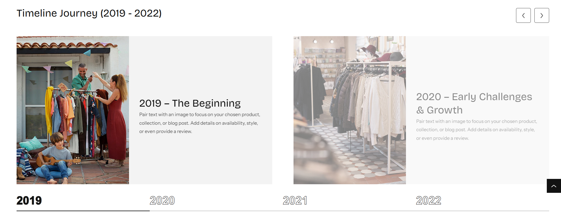
Timeline Section
The Timeline Section is a dynamic and interactive feature designed to showcase a series of events, milestones, or progressions in a structured format. With built-in slider functionality, users can navigate through different timeline points smoothly.
Customization Options:
Slider Navigation:
If a user adds more than two blocks, a slider will be enabled for easy navigation.
The timeline advances as users interact with the text options at the bottom, providing an intuitive browsing experience.
Interactive Text Navigation:
Below the slider, text-based navigation allows users to click on specific timeline points, which will move the slider to the corresponding slide.
This feature ensures a smooth and engaging way to explore different timeline stages.
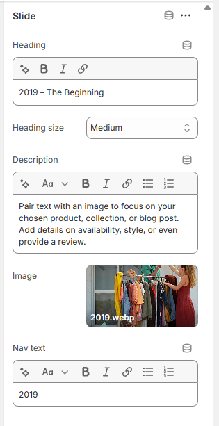
Block Settings:
Image Upload: Add an image to visually represent the milestone or event.
Description Field: Provide details about the event, product launch, or historical moment.
Heading & Heading Size Selector Customize the title and adjust its size for better readability.
Section Styling Options:
Adjust the background color and text color to match the store’s theme.
Ensures a cohesive and visually appealing presentation.
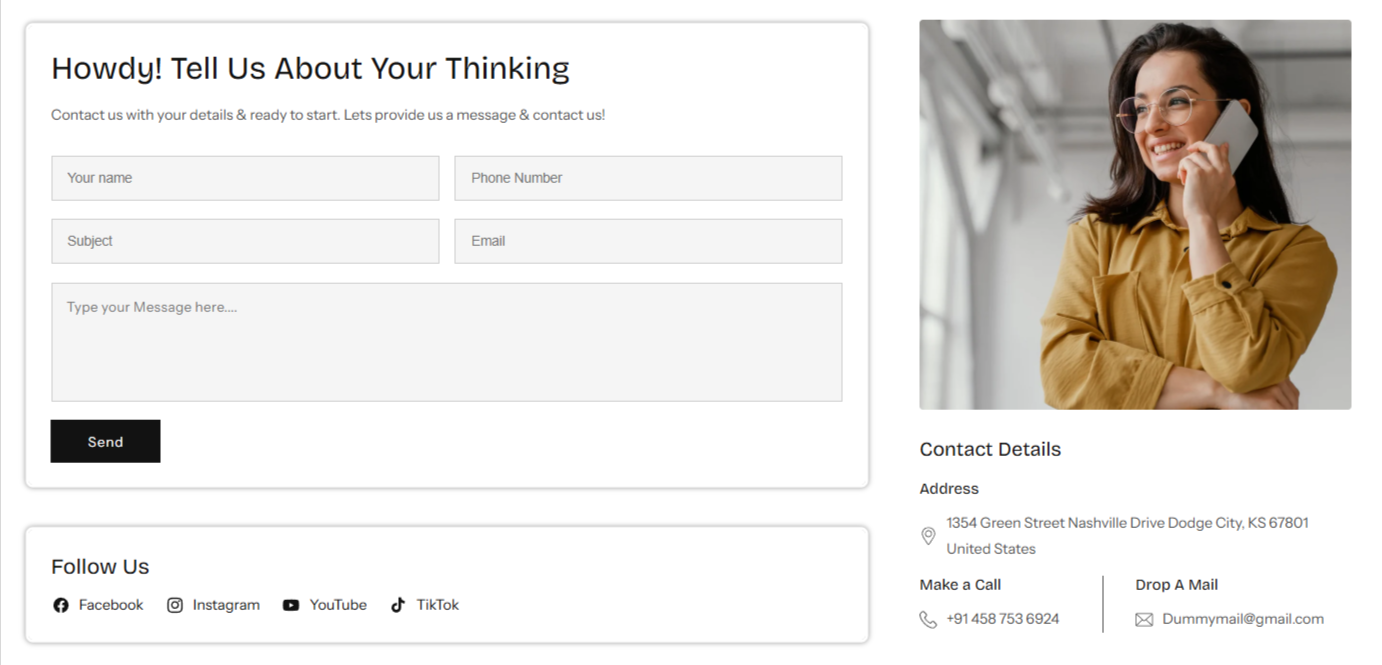
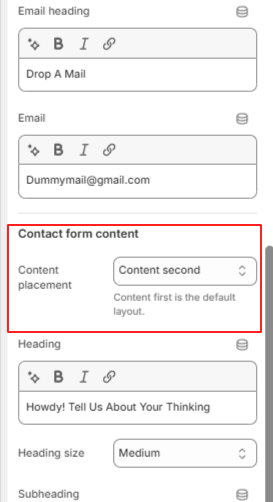
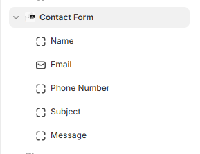
Contact Us
The Contact Us Section is designed to provide an easy and customizable way for customers to reach out. This section offers flexibility in layout and form customization to ensure seamless communication with visitors.
Customization Options:
Layout Selection:
Merchants can choose between a full-width contact form or a grid layout.
In the grid layout, one side features the contact form, while the other side can display additional contact details such as address, phone number, email, or a custom message.
Form Placement:
Users can change the placement of the form within the section to best fit the store's design.
Custom Form Fields:
The section includes a block system where merchants can add various form fields.
Available field options include:
Name,Email,Comment/Message
Heading & Heading Size Selector Customize the title and adjust its size for better readability.
Section Styling Options:
Adjust background colors, text colors, and form field styles to match the store’s branding.
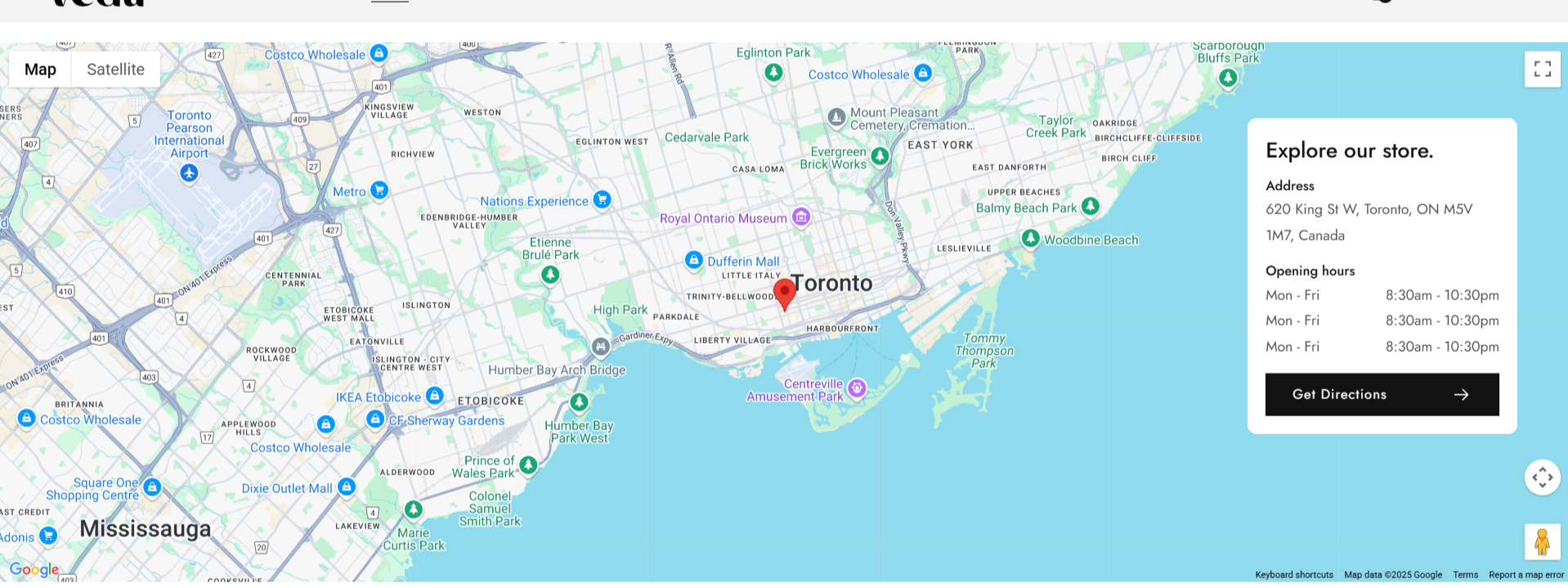
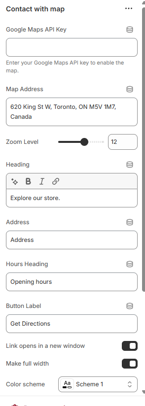
Contact with map
The Map Section allows store admins to dynamically configure and display a map on their website. The map functionality depends on an API key, and if no key is provided, a placeholder image will be displayed instead. The section also includes settings for adding contact information such as heading, address, and business hours.
Features:
Dynamic Map API Integration
Admins can input a Map API Key to enable the interactive map.
If no API key is provided, a placeholder image will be shown instead.
Customizable Contact Information
Heading: Set a title for the contact section (e.g., "Visit Us").
Address: Display the business location.
Operating Hours:Specify opening and closing times.
Additional Contact Details:Include phone number, email, or other relevant information.
Flexible Layout & Styling Options
Adjust padding and spacing dynamically to fit the website's design.
Option to enable or disable certain elements within the section.
How to Use
Navigate to the Theme Customizer.
Select the Contact With Map Section.
API Key: Enter the API key to enable the map.
Heading: Set a custom title for the section.
Address:Provide the location details.
Business Hours:Define the working hours.
Additional Contact Info:Add phone numbers, emails, or other details.
Save the changes and preview the section on the storefront.
Expected Behavior
If an API key is provided, the interactive map will display the set location.
If no API key is entered, a placeholder image will be shown.
Contact details will be displayed alongside the map for easy reference.
Layout settings will dynamically adjust based on admin configurations.
Notes
Ensure that the correct API key is entered to avoid errors in map loading.
Contact details should be accurate and up to date for better user experience.
Placeholder images can be customized if needed.
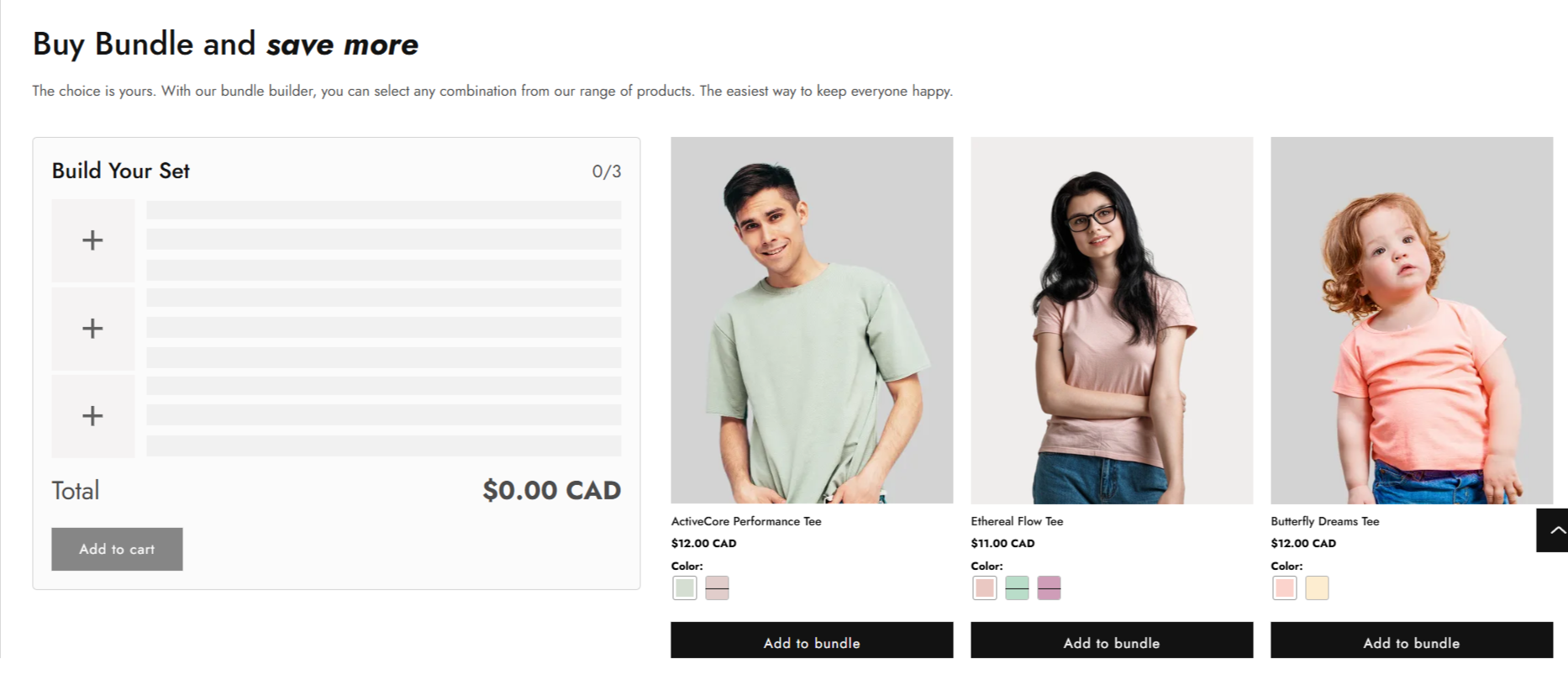
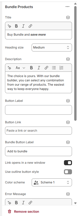
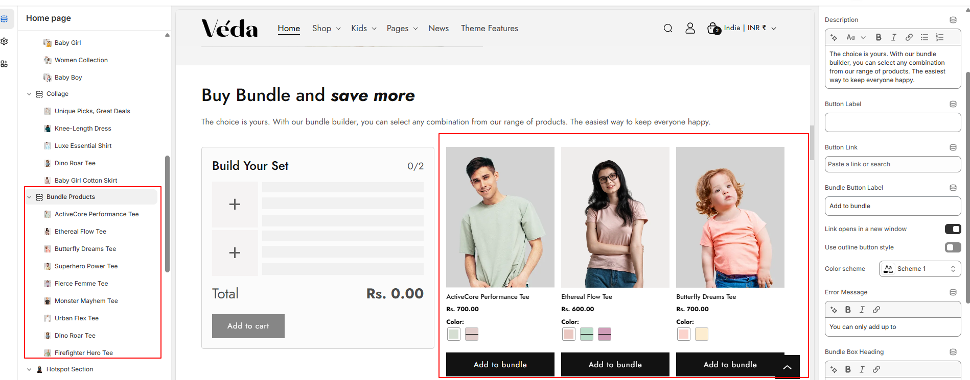
Bundle Products Section
The Bundle Section allows store admins to configure and display product bundles dynamically. This section enables customers to add bundled products to their cart while providing flexibility in settings for layout, padding, and descriptions.
Features:
Dynamic Bundle Limit:
Admins can set a limit on the number of products that can be included in a bundle.
Customers can only add products within this limit to their cart.
Product Block Selection:
Allows the selection of multiple products within the bundle.
Provides an intuitive interface for choosing products dynamically.
Dynamic Padding Settings:
Enables control over section padding to adjust spacing.
Customizable through theme settings for a better visual layout.
Product Block Selection:
Allows the selection of multiple products within the bundle.
Provides an intuitive interface for choosing products dynamically.
Customizable Description and Extra Information:
Admins can manage and display bundle descriptions.
Additional content, such as promotional text or guidelines, can be included.
How to Use
Navigate to the Theme Customizer.
Select the Bundle Section.
Bundle Product Limit: Set the maximum number of products allowed in the bundle.
Product Selection: Choose the products to be included in the bundle.
Padding Settings: Modify spacing around the section.
Save changes and preview the bundle on the storefront.
Note : "To apply a discount to bundled products, create a Shopify automatic discount for the specific products selected in the bundle section."
Global Schema Settings
The Global Schema Settings in Shopify allow merchants to define universal design elements that apply across the entire store. These settings ensure consistency in branding, typography, and color schemes, making customization more efficient and seamless.
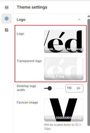
Logo Settings:
The Logo Settings allow merchants to upload and manage their store’s logo, ensuring consistent branding across all pages. The logo is used in various sections of the store, including the header, footer, and other design elements where branding is essential.
How to Manage the Logo:
Go to Online Store > Themes.
Click on Customize to access the theme editor.
Select Theme Settings from the left panel.
Upload a Logo:
Under the Logo section, upload an image for your store’s logo.
Supported formats include PNG, JPEG, SVG for high-quality display.
Adjust the logo size to fit different areas of the store.
Transparent Header Logo Option:
If your theme supports a transparent header, you can upload a separate logo for this view.
This ensures the logo remains visible against light or dark backgrounds.
General Logo Usage:
The uploaded logo will appear in the store header, footer, and other branding-related sections.
A properly configured logo enhances brand recognition and maintains a professional look.
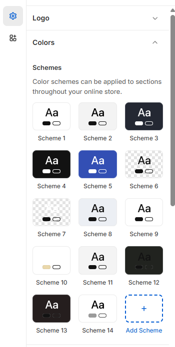
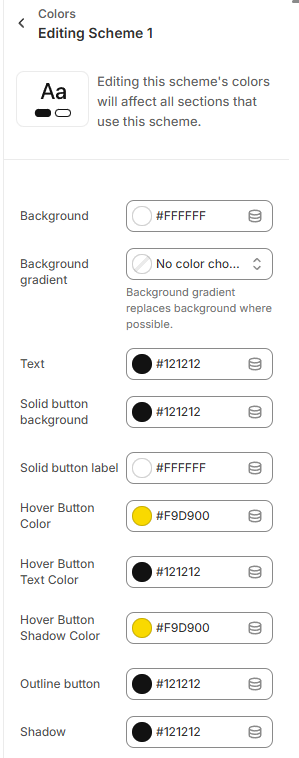
Color Settings
The Color Settings allow merchants to define and manage the overall color scheme of their store, ensuring a visually appealing and brand-aligned design. These settings apply to various elements across the store, including backgrounds, text, buttons, and other UI components.
How to Manage Color Settings:
Navigate to Theme Settings:
Go to Online Store > Themes.
Click on Customize to access the theme editor.
Select Theme Settings from the left panel.
Choose Colors to modify the store’s color scheme.
Color Customization Options:
Background Color: Set the primary background color for the entire store layout.
Gradient Color: Option to apply a gradient effect for more dynamic visual appeal.
Text Color: Define colors for headings, body text, and links to ensure readability.
Button Colors: Set the default color for primary and secondary buttons.
Box Shadow Color: Customize the shadow effect on elements like buttons and cards to enhance depth and contrast.
Applying a Color Schema:
Users must configure the color schema to maintain consistency.
The color schema applies to all store sections, ensuring uniformity across pages.
Different sections may allow individual color customizations if needed.
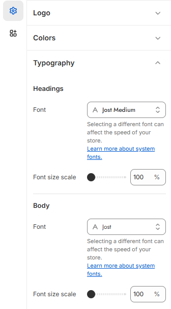
Typography Settings
The Typography Settings allow merchants to customize the text styles used throughout the store, ensuring a consistent and professional look that aligns with the brand identity. These settings control various aspects of text, including fonts, sizes, and styles.
How to Manage Typography Settings:
Navigate to Theme Settings:
Go to Online Store > Themes.
Click on Customize to access the theme editor.
Select Theme Settings from the left panel.
Choose Typography to modify text styles.
Typography Customization Options:
Primary Font Selection: Choose a default font for the store’s headings and body text.
Font Sizes: Set different sizes for headings (H1, H2, H3, etc.) and paragraph text.
Font Scale: Set diffrent font scale from the range bar
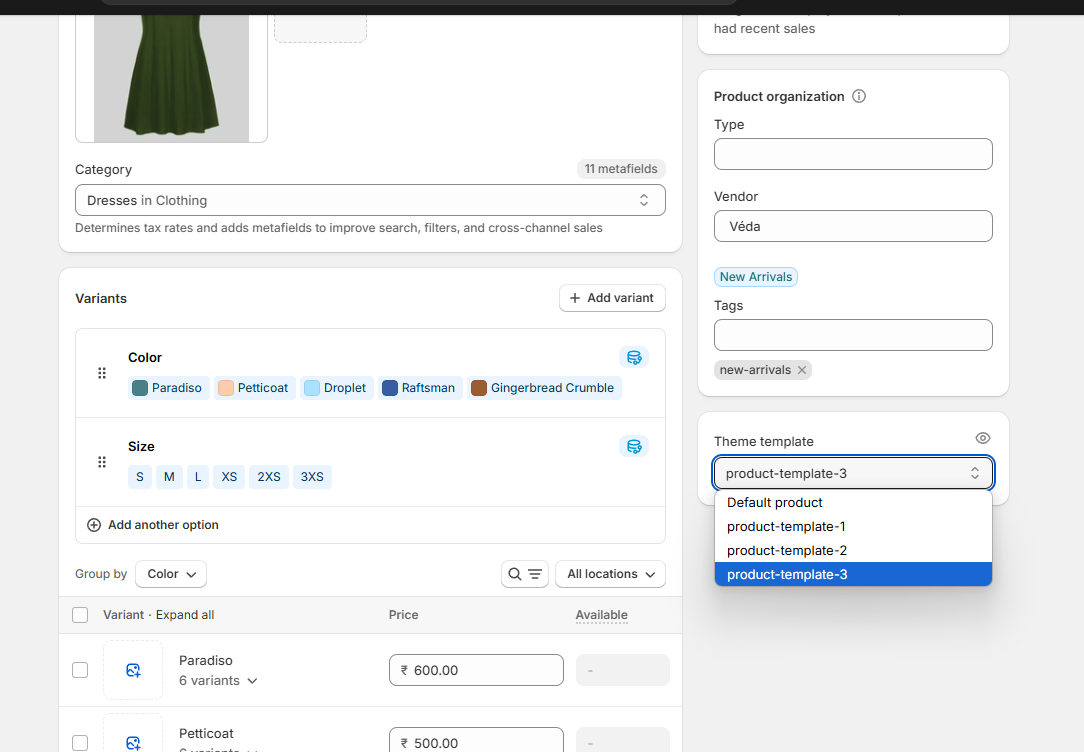
Product Cards
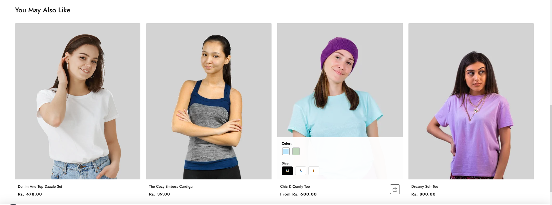
The Swatches Feature allows merchants to display product variant options (such as colors or materials) directly on product cards, enhancing the shopping experience by providing a quick visual reference for available variations.
How to Enable Swatches:
Navigate to Theme Settings:
Go to Online Store > Themes.
Click on Customize to access the theme editor.
Select Theme Settings from the left panel.
Choose Product Card settings.
Toggle the Swatches Option:
Locate the Enable Swatches option.
Toggle the setting ON to display swatches on all product cards.
Once enabled, the product cards will automatically show available color or variant options as swatches.
Collection and Product Settings
The Collection and Product Settings allow merchants to customize how products and collections are displayed throughout the store, enhancing the browsing experience for customers.
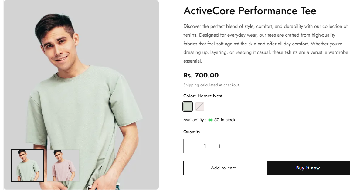
Product Page Settings
The Product Page Settings allow merchants to create a highly customizable and engaging product display, enhancing the shopping experience for customers.
How to Manage Product Page Settings:
Navigate to Theme Settings:
Go to Online Store > Themes.
Click Customize to access the theme editor.
Select Product Pages from the left panel.
Product Page Customization Options:
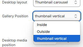
Thumbnail Slider Layouts:
Choose between Vertical Slider or Horizontal Slider for product image thumbnails.
Provides a flexible way to showcase product images based on the design preference.
First Layout :
Second Layout :
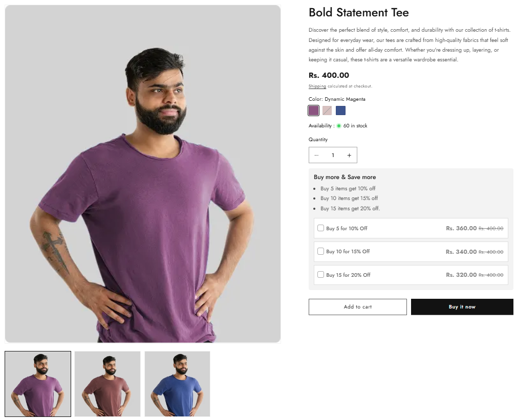
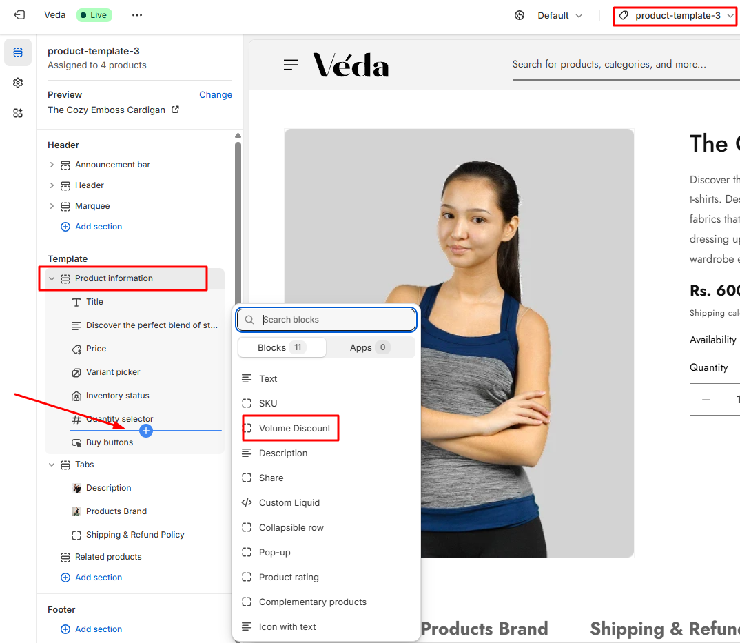
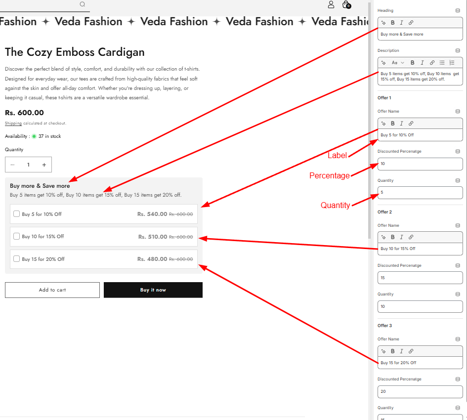
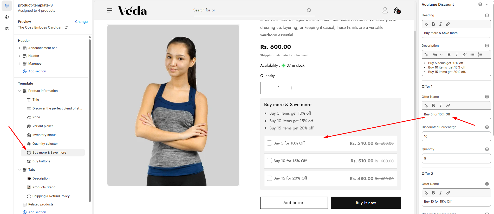
Product With Quantity Options :
You have options to add quantity based offers on product page
Fully customizable :
Fully customizable and auto calculated section
You just need to add Labels, Discounted Percenatge and Quantity
Note: You are only able to use volume discount under product template 3
Sticky Add to Cart:
Keeps the Add to Cart button visible as users scroll.
Enhances user convenience and encourages quick purchasing decisions.
Variant Selection:
Allows customers to choose product variations such as color, size, or material.
Works seamlessly with swatches
Tabs for Product Description:
Organizes product details into multiple tabs for a structured and readable layout.
Users can add both text and images in the description tabs.
Recently Viewed Products:
Displays products that customers have recently viewed.
Helps improve product discovery and encourages purchases based on browsing history.
Collection List
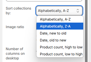
Now, you have complete control over how collections are displayed on your store. With our customizable Collection List settings, you can personalize the layout, sorting, and appearance to create the perfect browsing experience.
🛠 Key Customization Features:
1. Select Which Collections to Display
Easily choose which collections you want to showcase. Whether you want to highlight seasonal products, trending items, or specific categories, you can pick collections directly from the theme customizer.
2. Sorting Options for Collections
Organize collections in a way that best suits your store's needs. Choose from the following sorting options:
A-Z – Alphabetically arrange collections.
Z-A – Reverse alphabetical order.
Newest to Oldest – Highlight the most recently added collections first.
Oldest to Newest – Show collections in the order they were created.
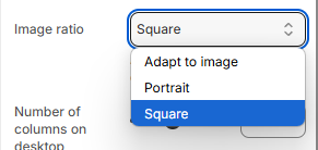
3. Control the Layout & Number of Columns
Choose between 1 to 4 columns to adjust the layout.
Optimize for desktop and mobile for a seamless experience.
4. Image Ratio & Display Options
Adjust the image ratio to fit your brand’s aesthetic.
Keep images uniform or allow for dynamic sizing based on the content.
5. Customize the Color Scheme
Background color
Text and button colors
Hover effects for an interactive experience
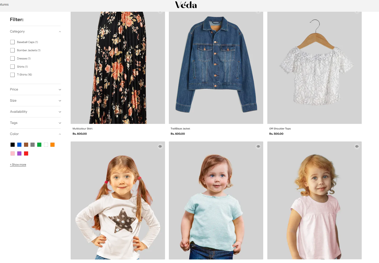
Collection Products
Explore Our Collections with Enhanced Shopping Features
Swatches & Quick Add to Cart – Simply hover over a product to view available color swatches and quickly add your favorite item to the cart without leaving the page.
Quick View Option – Get a closer look at product details instantly with our Quick View feature. No need to navigate away—just click and explore!
Universal Collection Banner – Enjoy a clean and consistent shopping experience with a visually appealing banner across all collections.
Collection Featured Image Option – Choose to display a unique featured image for each collection or stick with the universal banner.
Advanced Filters – Easily narrow down your search with filters for color, size, and more. Simply assign categories to products and use the Color Metafield selection to define swatches for better organization.
Key Features of Our Collection Page
1. Swatches & Quick Add to Cart
Now, when you hover over a product, you’ll see available color swatches, allowing you to preview different options without opening the product page. Plus, you can add items directly to your cart using the Quick Add to Cart button, streamlining your shopping experience.
How it works:
Hover over a product to see color options.
Click on the swatch to preview different variants.
Use the Quick Add button to add items to your cart instantly.
2. Quick View for Instant Product Details
Instead of navigating to a separate product page, you can now click Quick View to see key details in a pop-up window. This allows you to check prices, descriptions, and available options quickly.
How it helps:
Saves time by letting you browse products without leaving the collection page.
Helps you make quicker purchasing decisions.
3. Universal Collection Banner
To keep our store visually consistent, we’ve added a common banner across all collections. This creates a cohesive look while still keeping the focus on the products.
Customizable Option:
If you prefer, you can choose to display a collection-specific featured image instead of the default banner.
4. Advanced Filtering System (Color, Size, and More!)
Color
Size
Other attributes (like material, style, etc.)
How to Use Filters:
Simply select the relevant options from the filter menu.
Instantly refine your search to find exactly what you need.
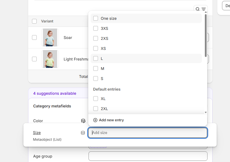
5. How to Assign Color & Size Swatches to Products
Steps to Add Color Swatches:
Assign a category to your product.
Use the Color Metafield to select and define colors.
Name the option "Color" in the product settings.
Swatches will automatically appear on the collection page.
Steps to Add Size Swatches:
Follow the same steps as above but use the Size Metafield instead.
Name the option "Size" to ensure it integrates correctly.
Tip: You can add other swatches (like material, style, etc.) using the same method by defining the relevant metafield.
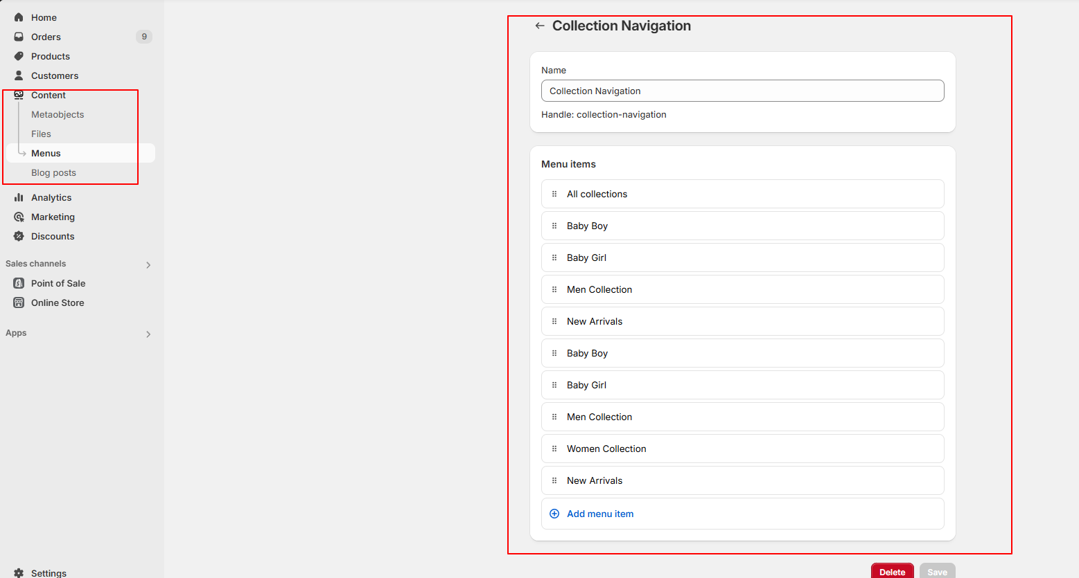
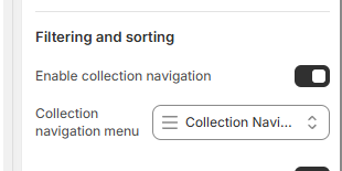
Collection navigations:
A Collection List Navigation section has been added to the Collections Page, which displays a list of all available collections. This allows users to easily browse and navigate to a specific collection with a single click, without having to scroll through the entire page.
Key Features:
Displays all available collections in a clean, accessible list format.
Each collection item is clickable and links directly to the corresponding collection page.
Provides a faster and more intuitive way for users to find what they're looking for.
How to manage
Go to the admin
Click on the Content > Menus > Add menu > Collection.
Go to the customizer
click on the product grid
Pick the collection menu
Click save.
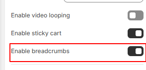
Breadcrumbs on Collection and Product Pages
A Breadcrumbs option has been added to both Collection and Product pages to improve navigation and user experience. Breadcrumbs help users understand their location within your store and make it easier to navigate back to previous pages.
Key Features:
Enable/Disable OptionEasily turn breadcrumbs on or off from the theme settings depending on your design and user flow preference.
Automatic Breadcrumb StructureWhen enabled, breadcrumbs display the hierarchy of the page, such as:
Home > Collection > Product
How to Manage the Breadcrumb Setting
Go to your Theme Editor.
Navigate to the Collection Page or Product Page section.
Look for the Breadcrumbs setting.
Toggle the Enable/Disable switch based on your preference.
Save your changes and preview the page.
Other Section
Explore our additional pages, from our story and latest blog posts to important policies and contact details.
Blogs
Stay updated with the latest news, trends, and insights! Our blog is your go-to source for expert tips, product updates, and inspiring stories.
🔧 Blog Customization Options
Show/Hide Featured Image – Choose whether to display the featured image for each post to keep the layout clean or visually engaging.
Show/Hide Date – Display the publication date to keep your readers informed about the latest updates, or hide it for a timeless look.
Show/Hide Author – Highlight the writer behind each post with an author name and profile image, or keep the focus on the content.
Image Ratio Settings – Adjust the image ratio to fit your design preference, ensuring a visually appealing and uniform blog layout.
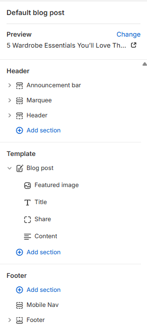
Blog Post
Welcome to our blog, where we share stories, tips, and updates to keep you informed and inspired. Whether you're looking for expert advice, industry trends, or creative ideas, you’ll find it all here.
🛠 Blog Post Customization Options
Add a Featured Image – Upload and showcase a high-quality image to make your post visually engaging.
Custom Blog Title – Craft a compelling title that grabs attention and sets the tone for your post.
Share Your Content – Easily share your blog post on social media platforms to reach a wider audience.
Rich Blog Content – Use text, images, and formatting tools to create engaging and informative posts.
Reader Engagement – Encourage discussions with a comment section and share buttons.
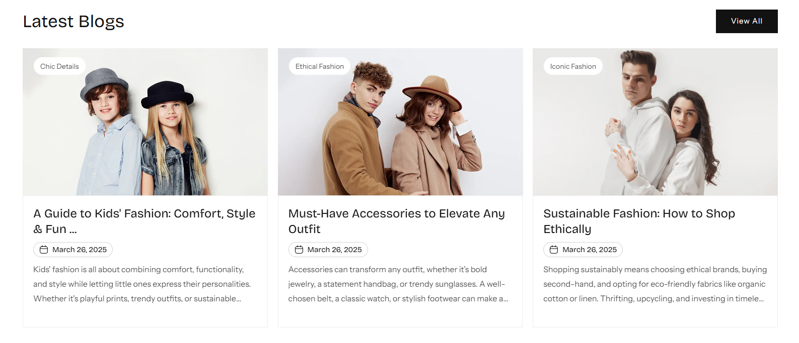
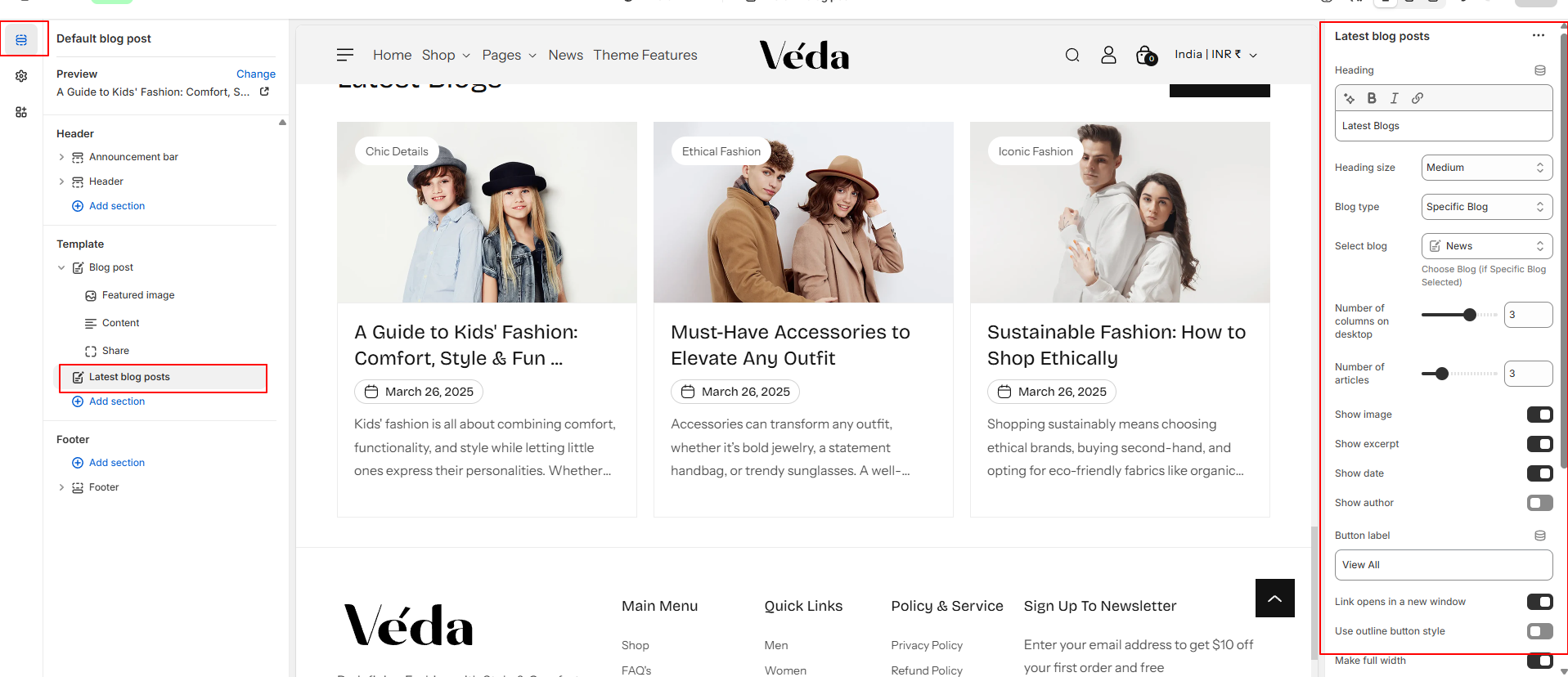
latest Blogs
The Latest Blogs section allows you to showcase recent blog posts dynamically, making it easier for users to discover fresh content. This section can be added to any page and customized to suit your design and content needs.
Features
Blog Source Selection
Choose to display posts from:
A specific blog (e.g., News, Updates, Stories)
All current blogs
Automatic Sorting: Posts are sorted by the date they were published, showing the most recent content first.
Post Limit: Set how many blog posts to display in the section (e.g., latest 3, 4, or 6 posts).
How to Manage:
Go to your Theme Editor.
Add a new "Latest Blogs" section to the desired page.
Select the blog source.
Choose the number of posts to show.
Adjust layout settings as needed.
Save your changes and preview the section.
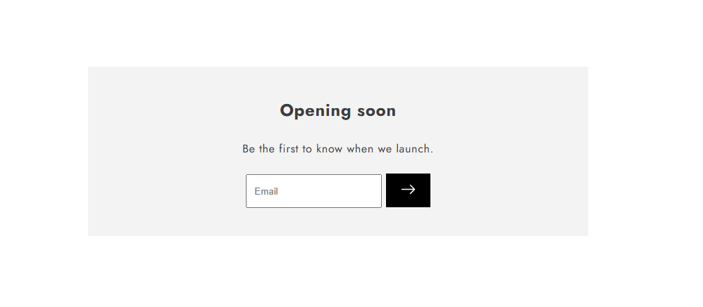
Password
🔒 Coming Soon – Stay Tuned!
We're working behind the scenes to bring you something amazing! Our store is currently locked, but we'll be launching soon. Sign up below to be the first to know when we go live!
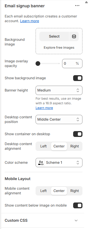
🛠 Password Page Customization Options
Background Image Option – Set a custom background image to match your brand’s style or leave it minimal for a clean look.
Show/Hide Background Image – Choose whether to display a background image or keep it simple with a solid color.
Image Overlay Effect – Adjust the overlay to control brightness and contrast, ensuring the content remains readable.
Content Positioning – Align your message left, right, or center to create the perfect visual balance.
💌 Be the First to Know! Enter your email below, and we'll notify you as soon as we launch.
Password customizer settings:
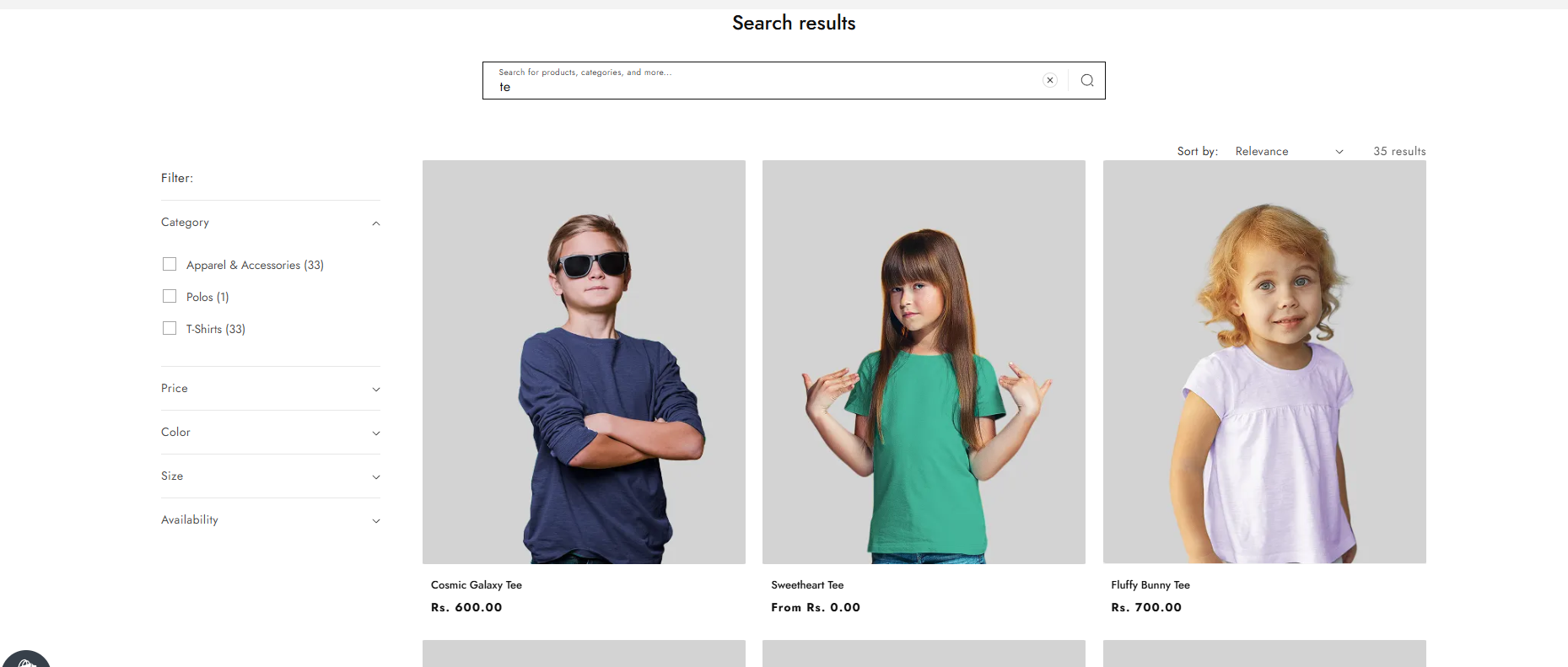
Search Page
Easily browse through search results with flexible display options to enhance your shopping or reading experience. Customize how results appear to match your style and preferences.
🛠 Search Results Customization Options
Image Ratio & Shape – Adjust the image ratio and shape to maintain a clean and uniform look across all search results.
Show/Hide Vendor – Display the product or content vendor for more transparency or keep it hidden for a minimalistic layout.
Flexible Filtering – Choose where the filter options appear (sidebar, top, or dropdown) for better navigation.
Show/Hide Date – Display the publishing date for blog posts and news items or hide it for a timeless look.
Show/Hide Author – Highlight the author’s name on relevant search results, making it easier to discover content from your favorite writers.